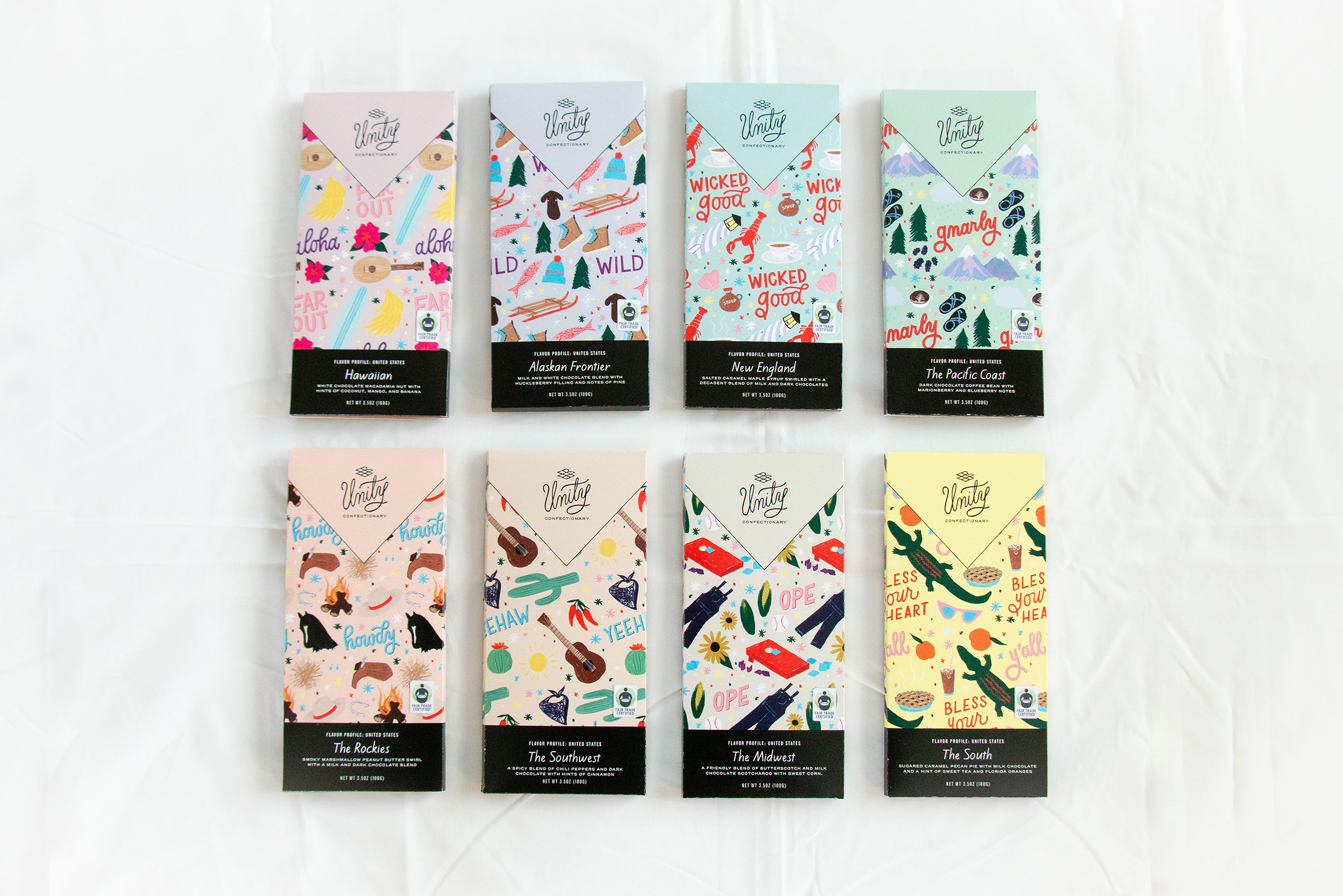
Unity Confectionary
Categories:
Brand & Logo Design, Animated Logo, Illustration, Hand-lettering, Packaging Design, App Prototype Design, Layout Design
Brief:
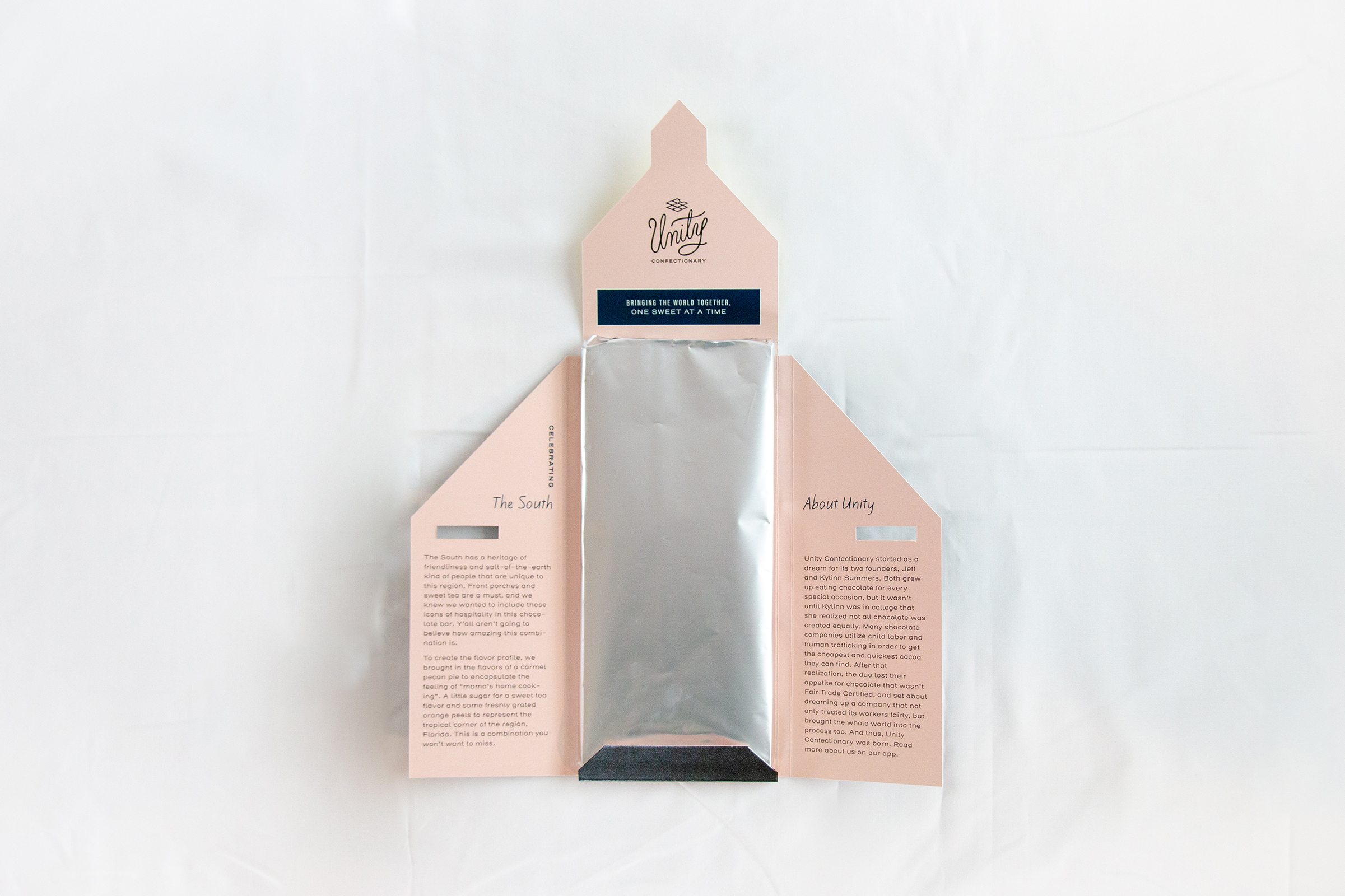
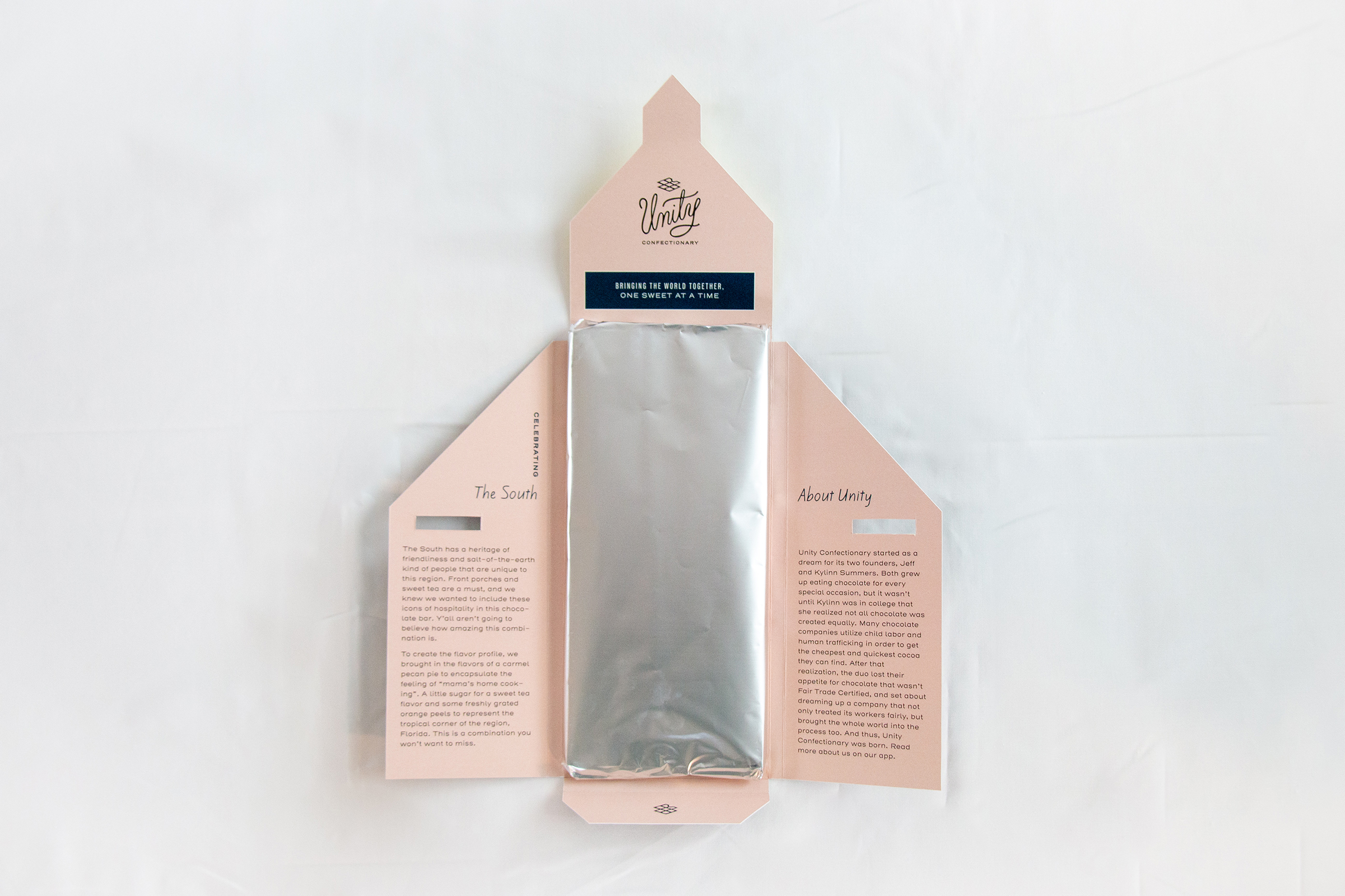
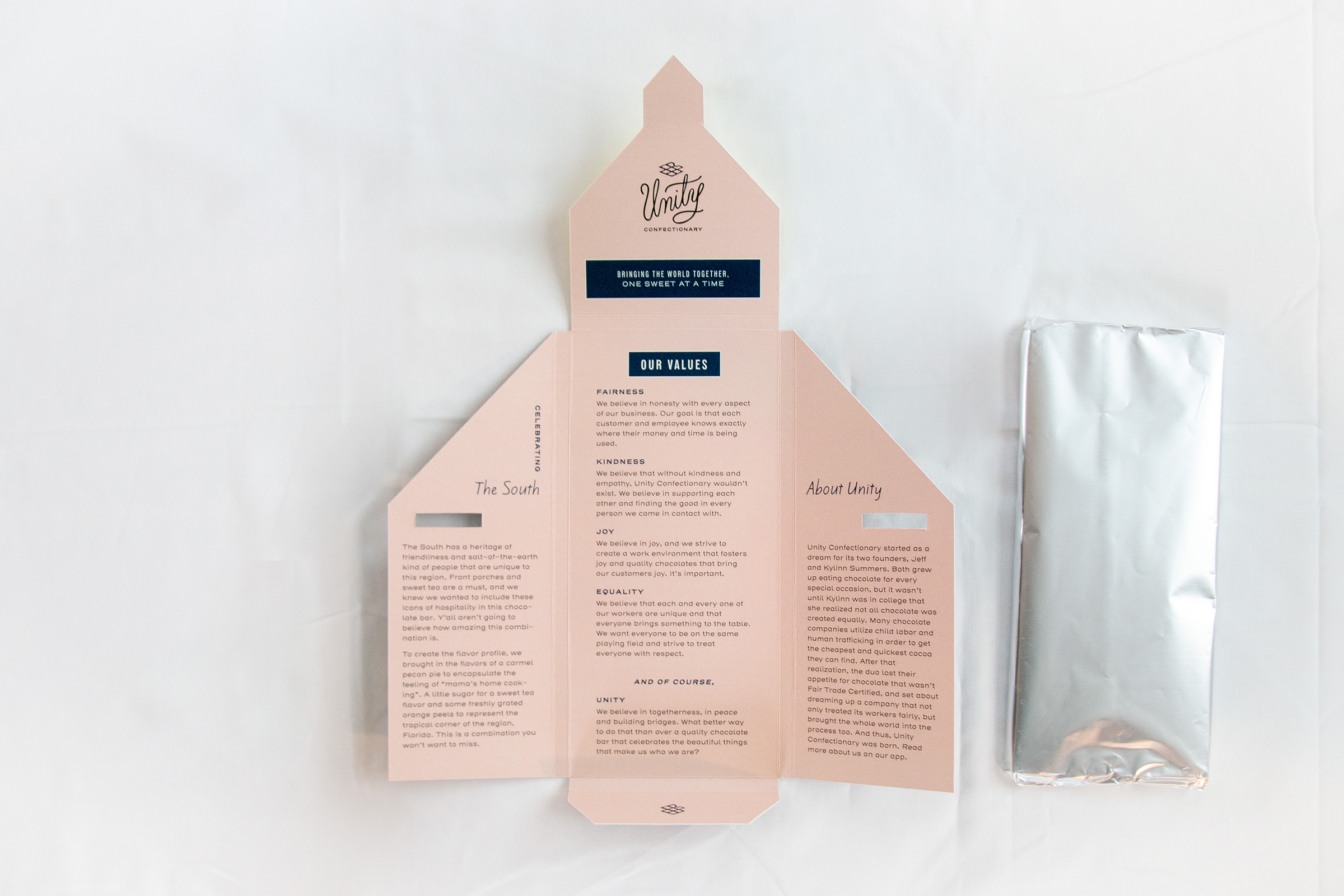
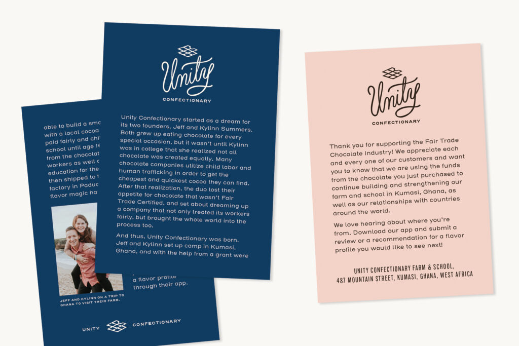
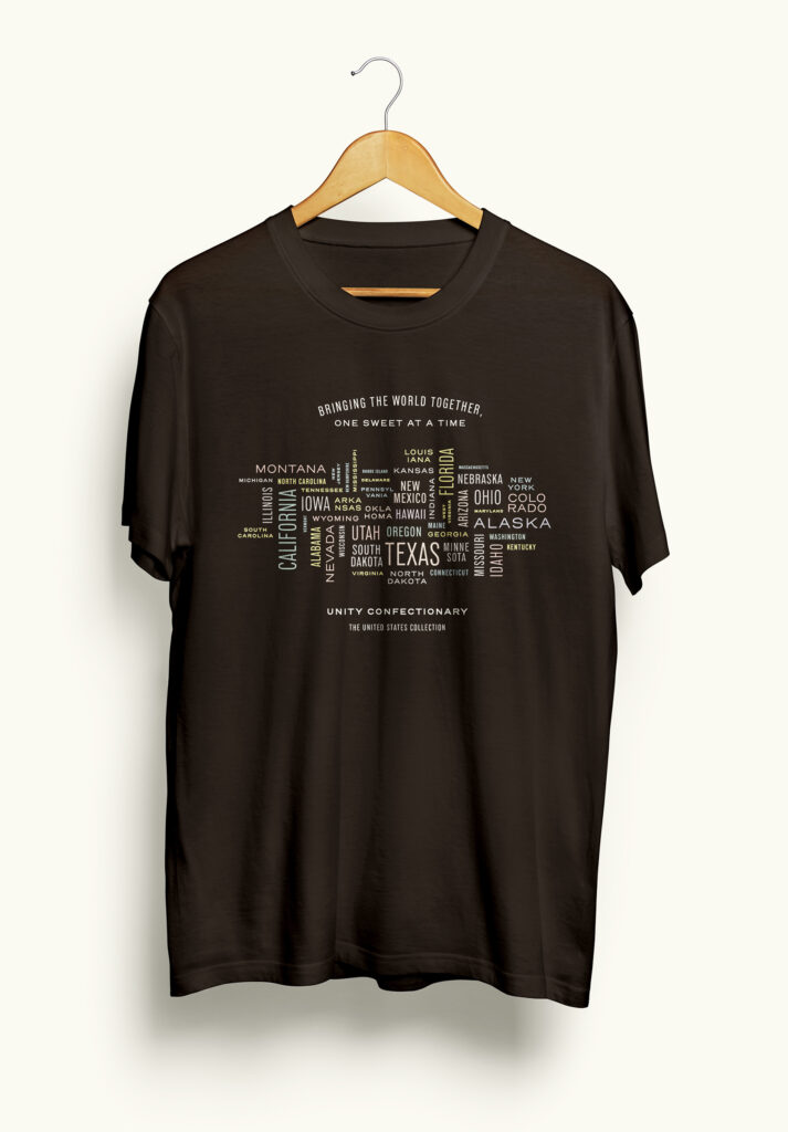
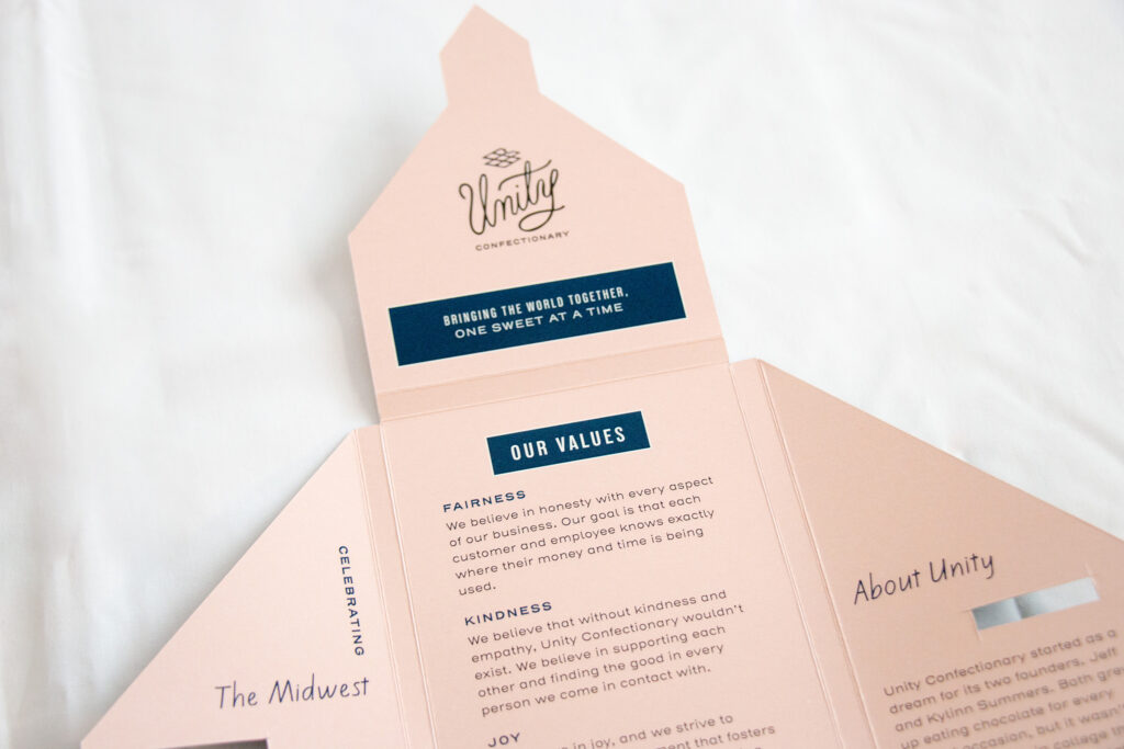
For this project, I created a brand identity for Unity Confectionary, a conceptual chocolate farm and online store. One of the big no-nos in the chocolate industry is that many times it involves human trafficking and child labor. I wanted to create a company that not only does not allow that, but also helps support a better lifestyle for those kids. Unity Confectionary was created to “bring the world together, one sweet at a time”. This is a chocolate brand that builds a school on each of their cocoa farms. Adult workers are allowed to work a full, paid day, but children are required to go to school until at least age 16. Sales from the chocolates themselves completely fund the school, as well as donations from loyal customers. The unique thing about this brand is that they work with customers to create flavor profiles for regions of the world. Customers can submit a region that they would like to highlight, and Unity works to create unique and delicious chocolate flavors (and packaging) to represent those regions.
Process:
I’ve always thought it would be fun to create a chocolate company that celebrates the different regions of the United States—coming from the Midwest, we have a lot of (very true) stereotypes, and I know that other regions have their own quirks that they are known for. I wanted to celebrate those differences by creating fun chocolate flavors based on these connotations and stereotypes.
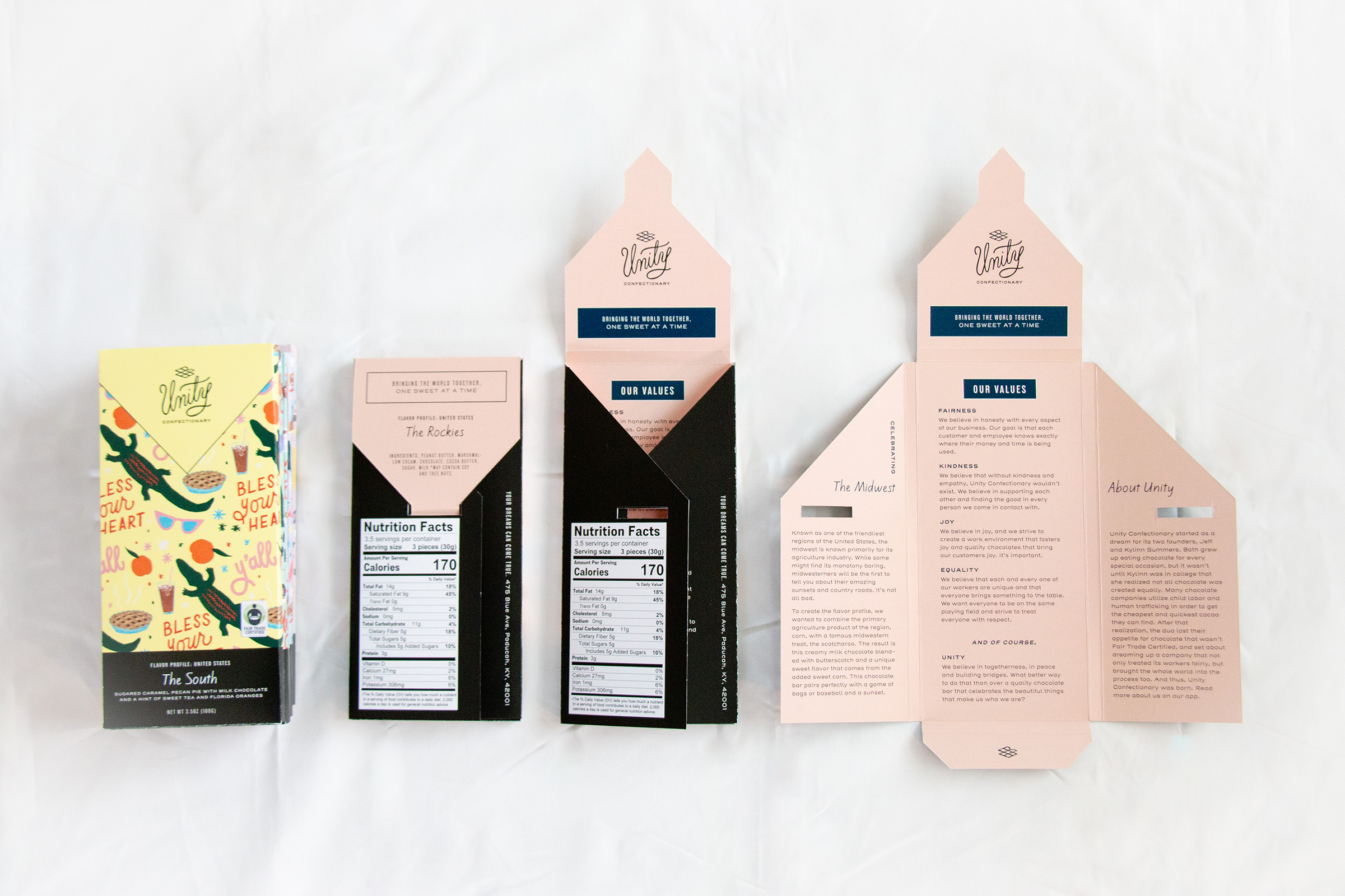
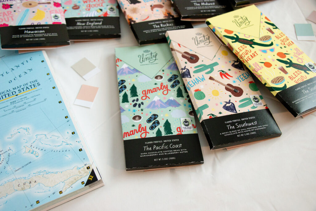
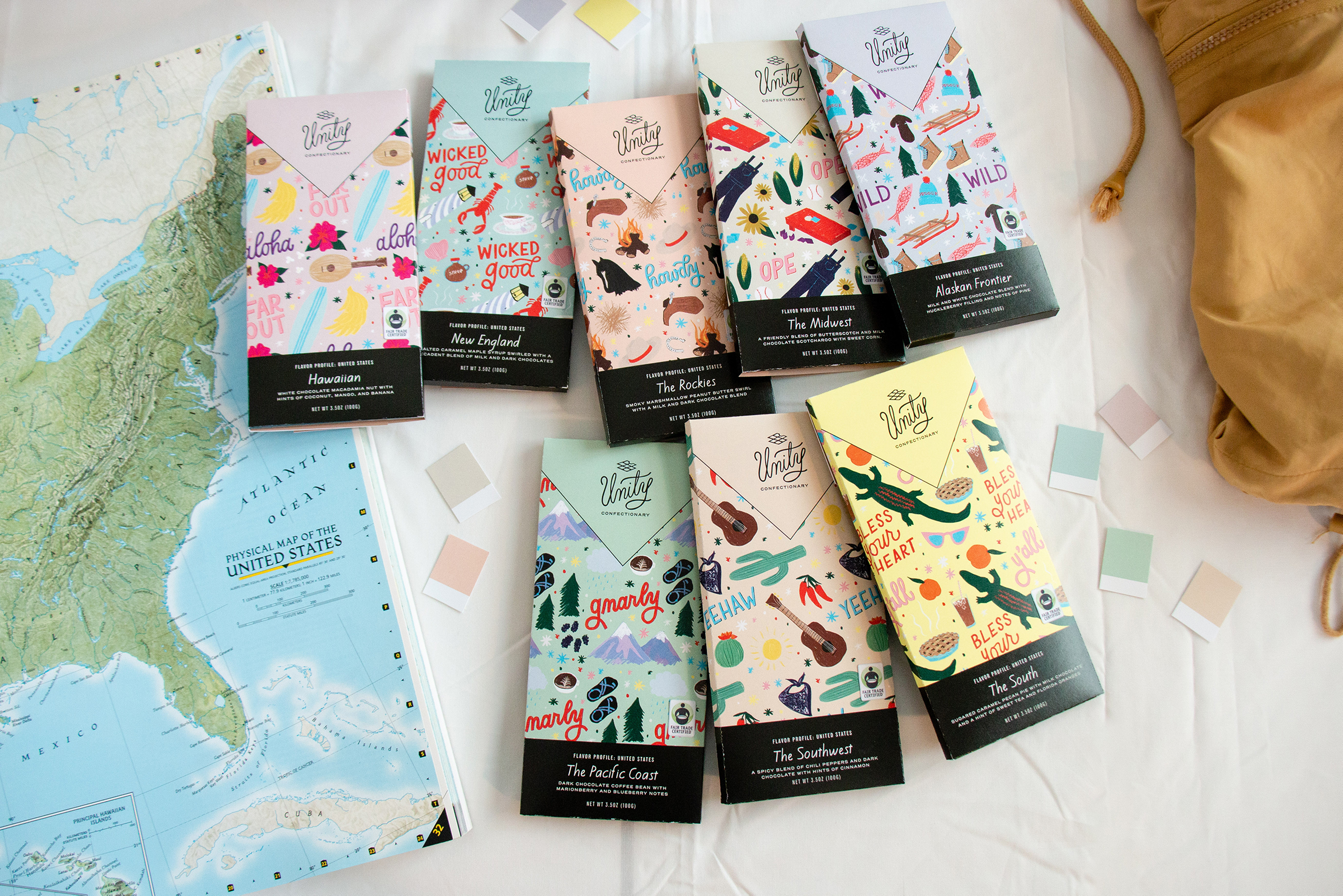
This project involved some research. There are many blog sites where people talk about their region’s stereotypes and what is true and what is not true. I also did a poll on my Instagram where I asked people what stereotypes they thought of when they thought of various U.S. regions. Once “the people spoke”, I narrowed down the answers I received to best represent those regions. The goal of Unity Confectionary is to unite people through chocolate, so I kept all of the attributes positive and fun. I then illustrated some iterations of those phrases and items that each region is known for, creating a unique pattern for each chocolate bar. The flavors themselves were also inspired by the regions (read detailed profiles of each chocolate bar and the inspiration behind them below).
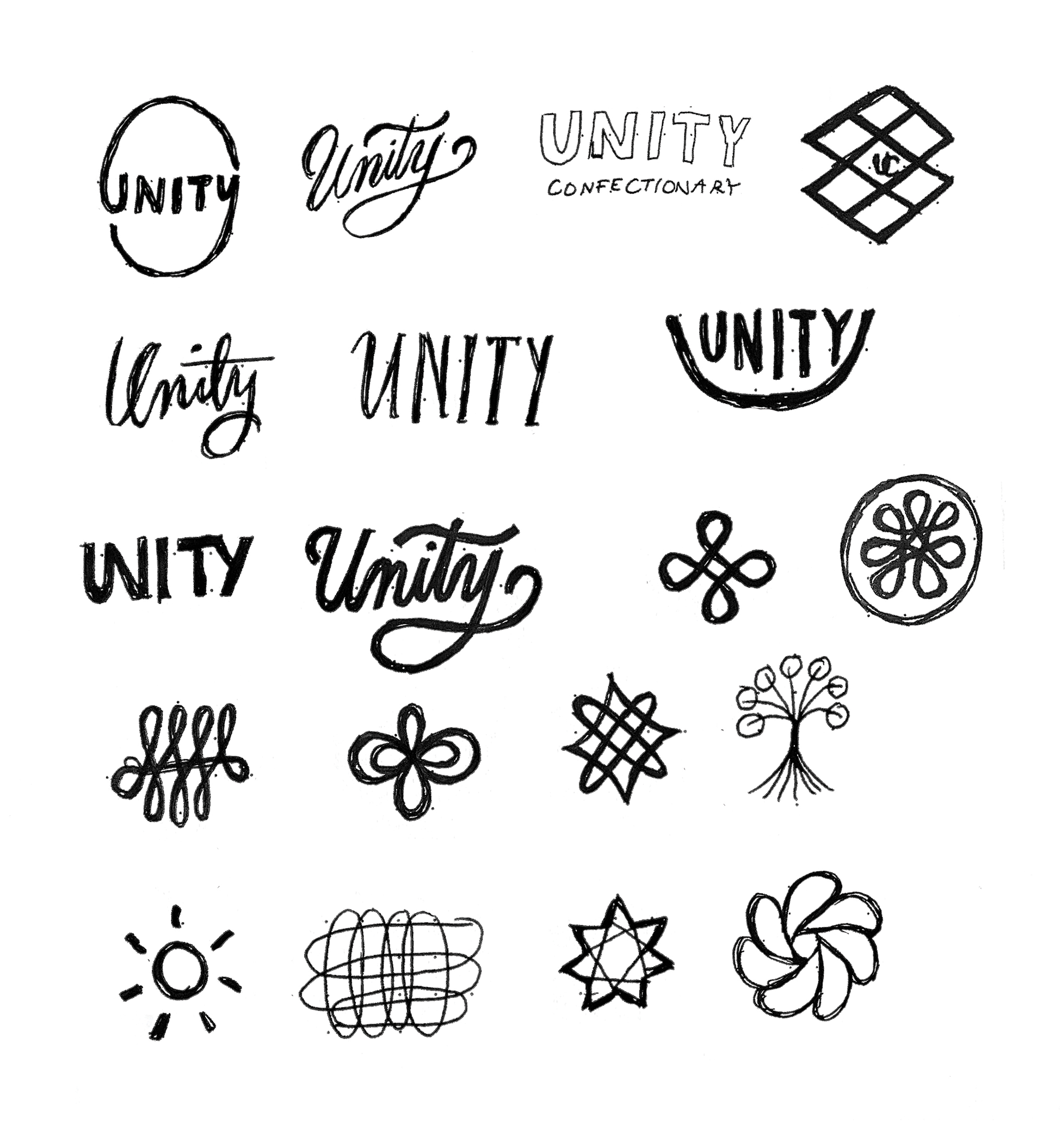
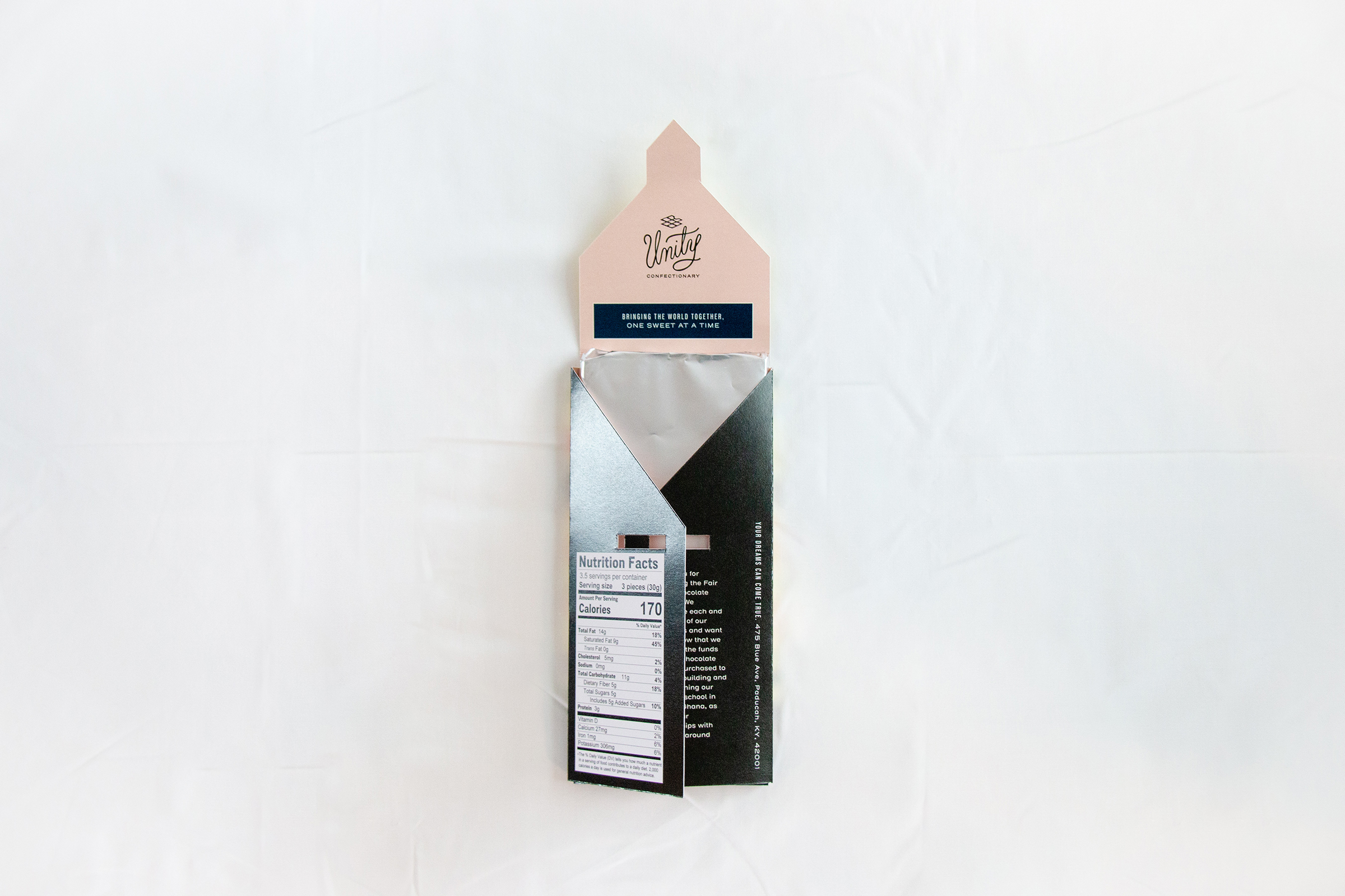
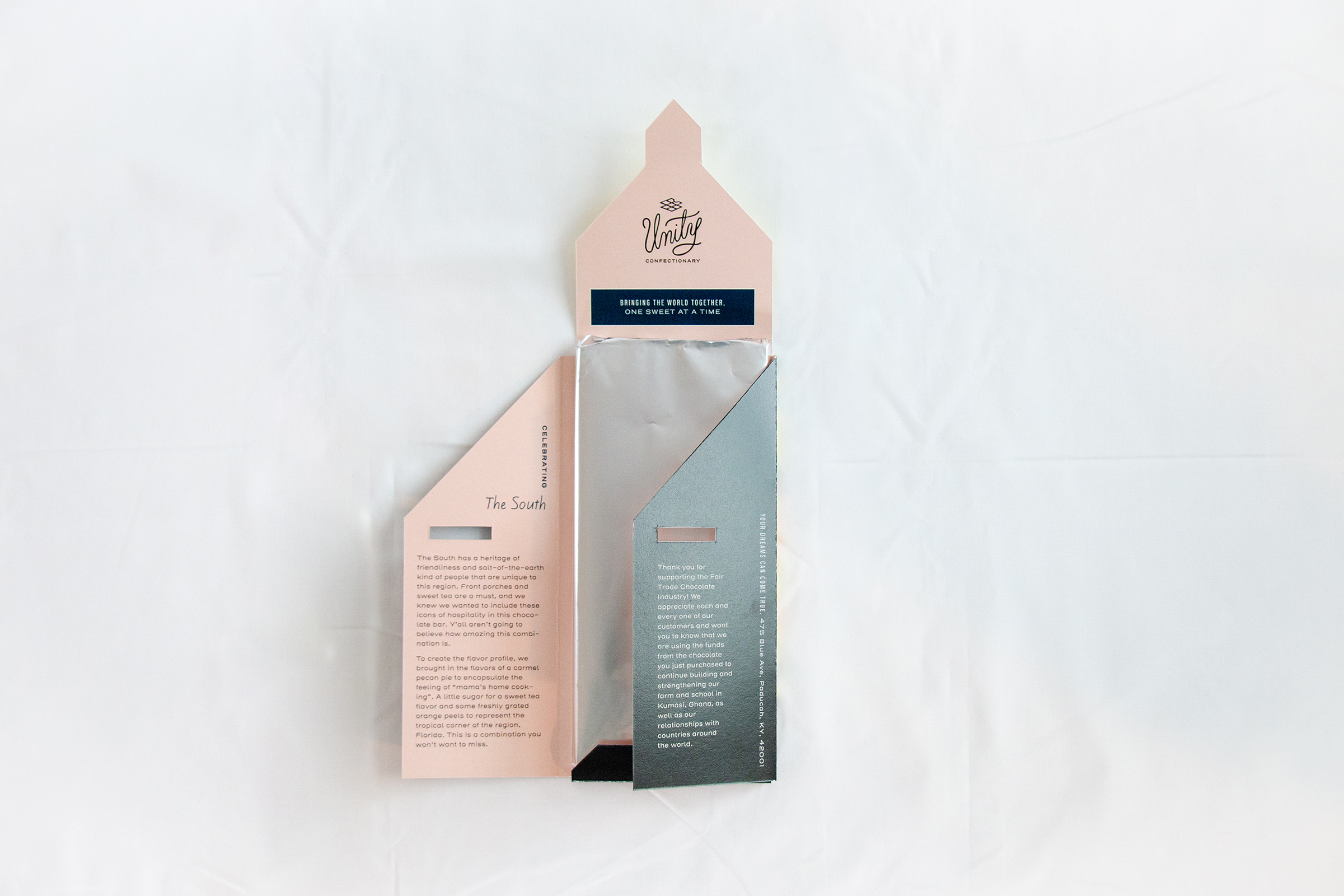
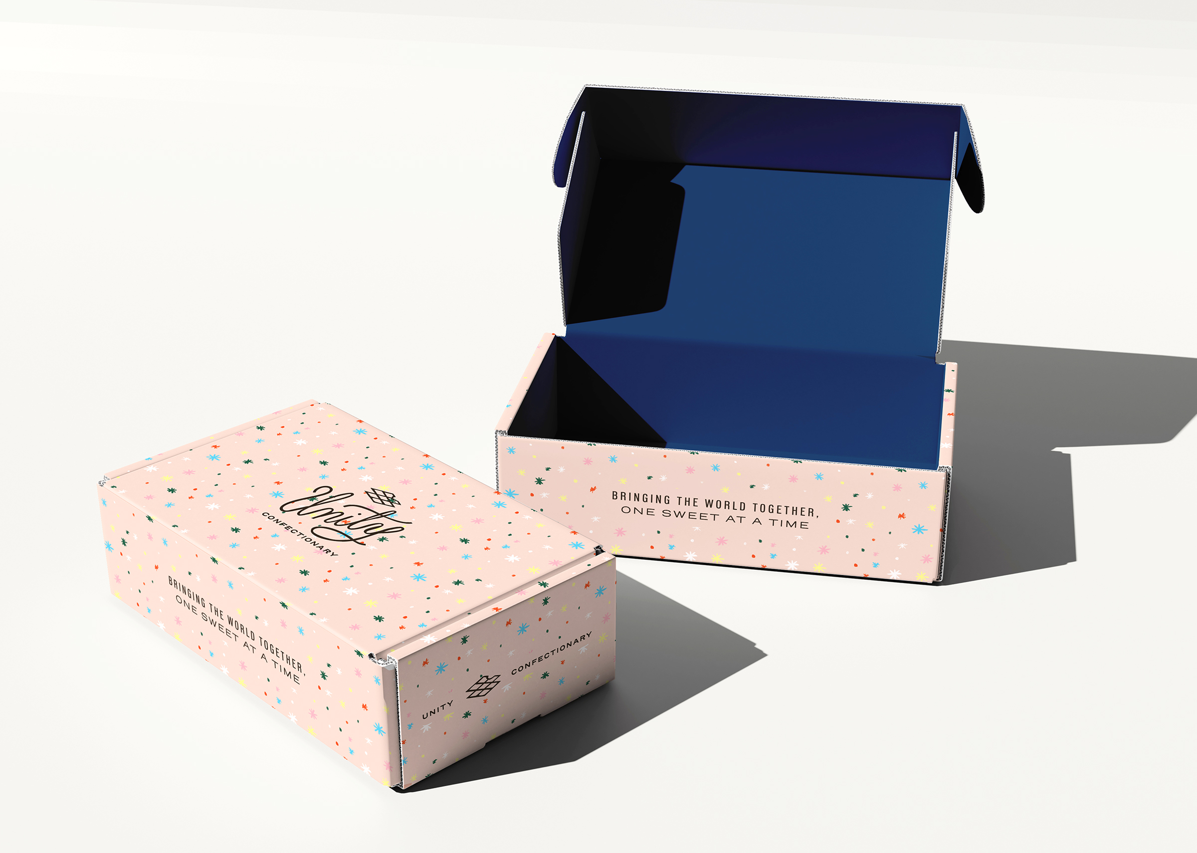
In entirety, I created fun, bright illustrations to represent each region for the chocolate bar packaging. The logo itself is hand-lettered in a loopy script font, to represent Unity and the people aspect of the business. The icon represents the seven continents of the world, unity and togetherness, and of course, our product, chocolate. The brand color palette of deep brown, warm blue, blush pink and cream work together to represent who Unity is. Brown is stable and rich, representing the chocolate. Blue is the color of unity and togetherness, while the muted pink brings a warm and homey touch to the brand. Cream is warmer than white and ties it all together. The pairing of two sans-serif fonts as the brand typefaces make this brand friendly and approachable, while not competing with the illustrations that are included with each packaging. Unity’s goal is bringing people together, and what better way to do that than through chocolate?
Flavor profile:
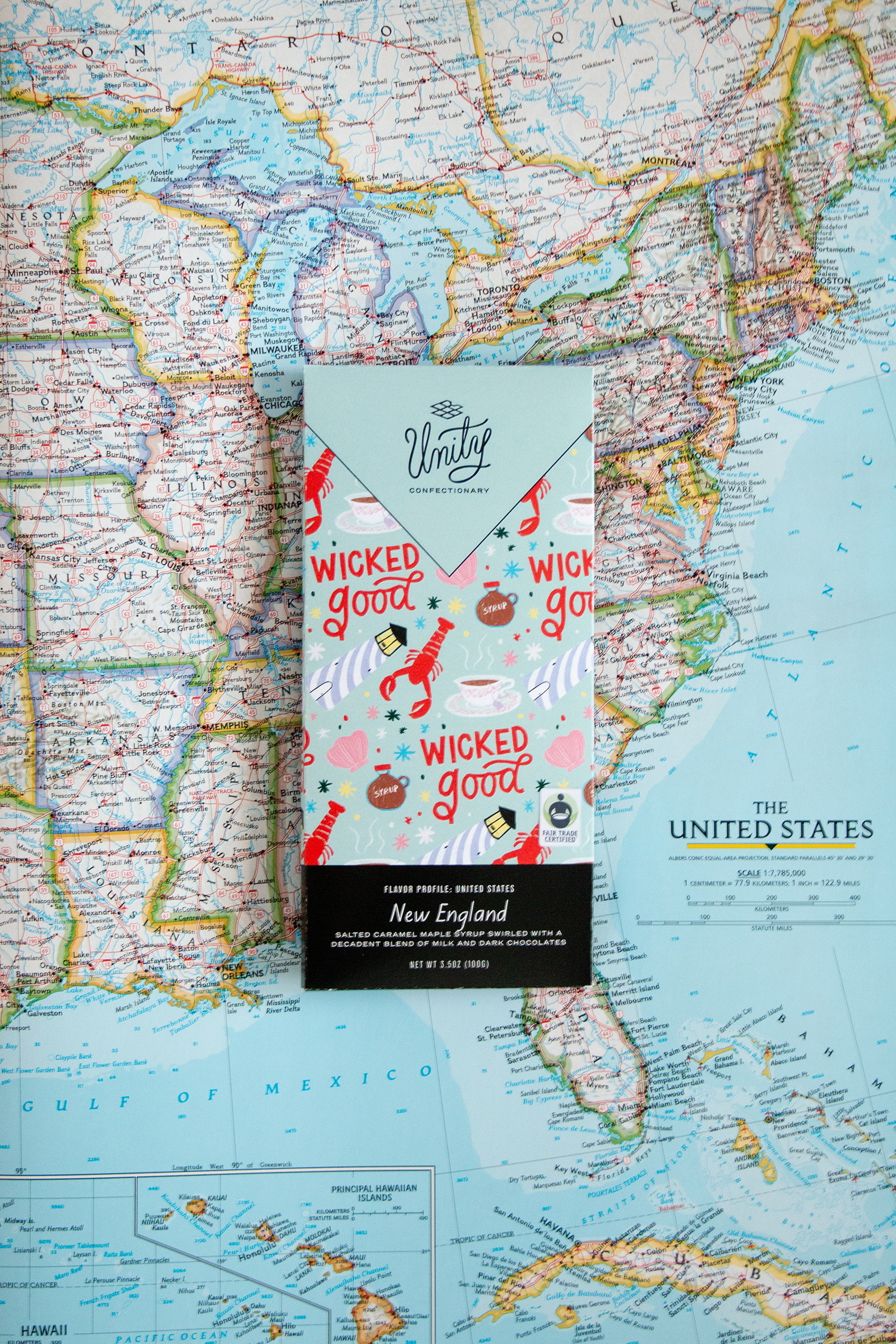
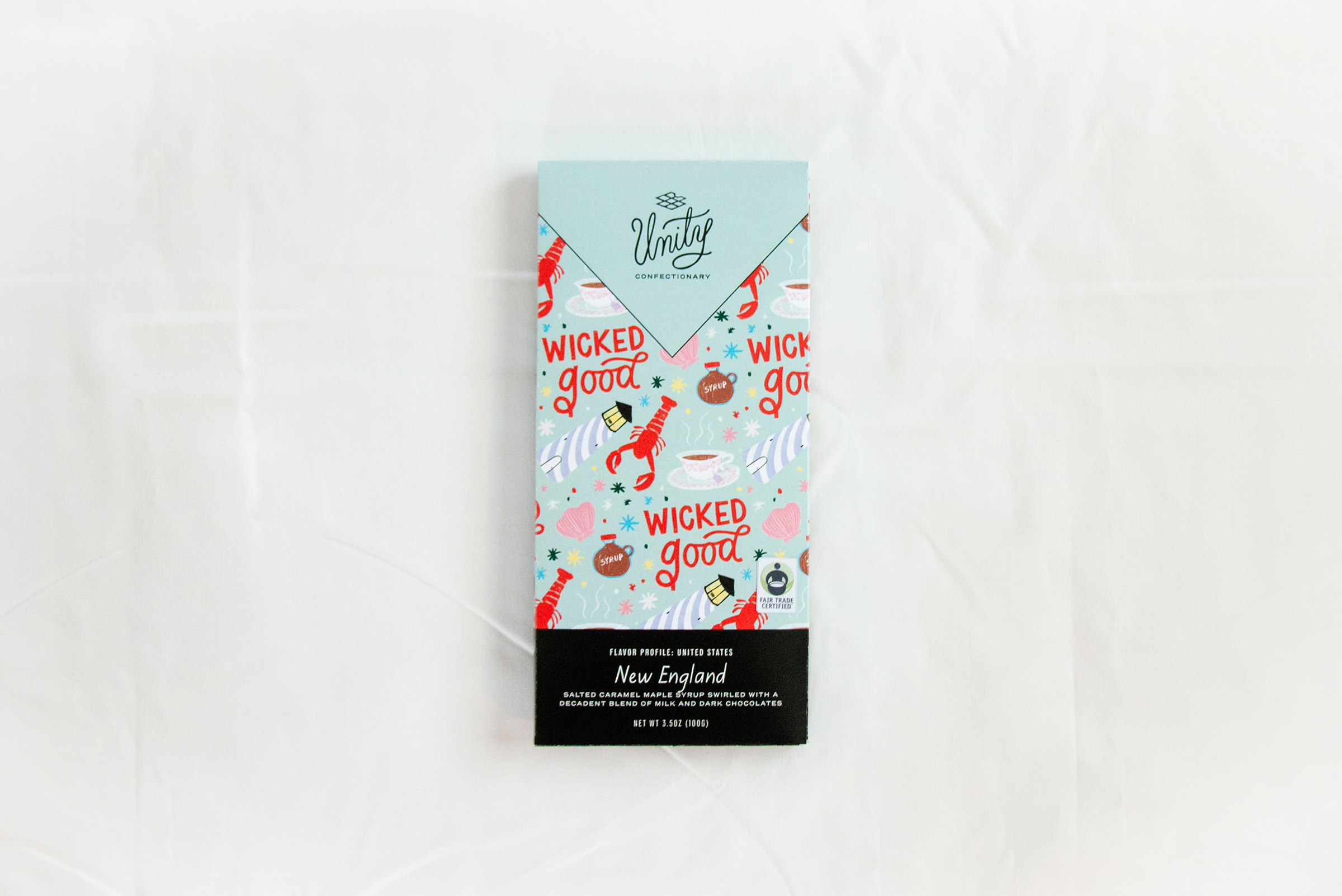
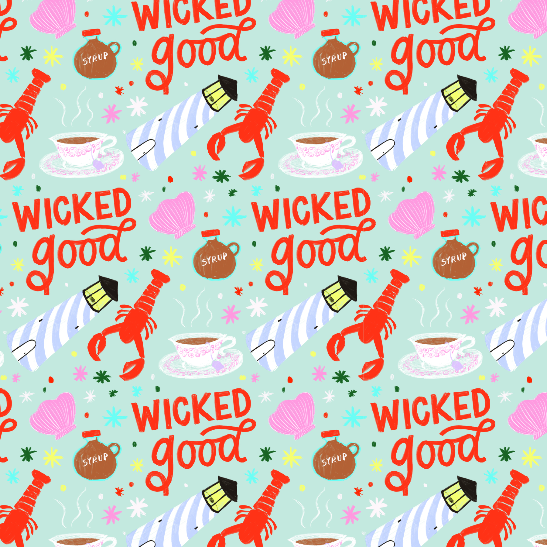
Salted caramel maple syrup swirled with a decadent blend of milk and dark chocolate.
New England is known for being quaint, educated, loving seafood, being a little salty (hello the Atlantic and also New York City) and for their pure maple syrup. They also say “wicked good” a lot, which simply means “that’s awesome” to the rest of us who don’t speak New England. And has anyone heard of the Boston Tea Party?
flavor profile:
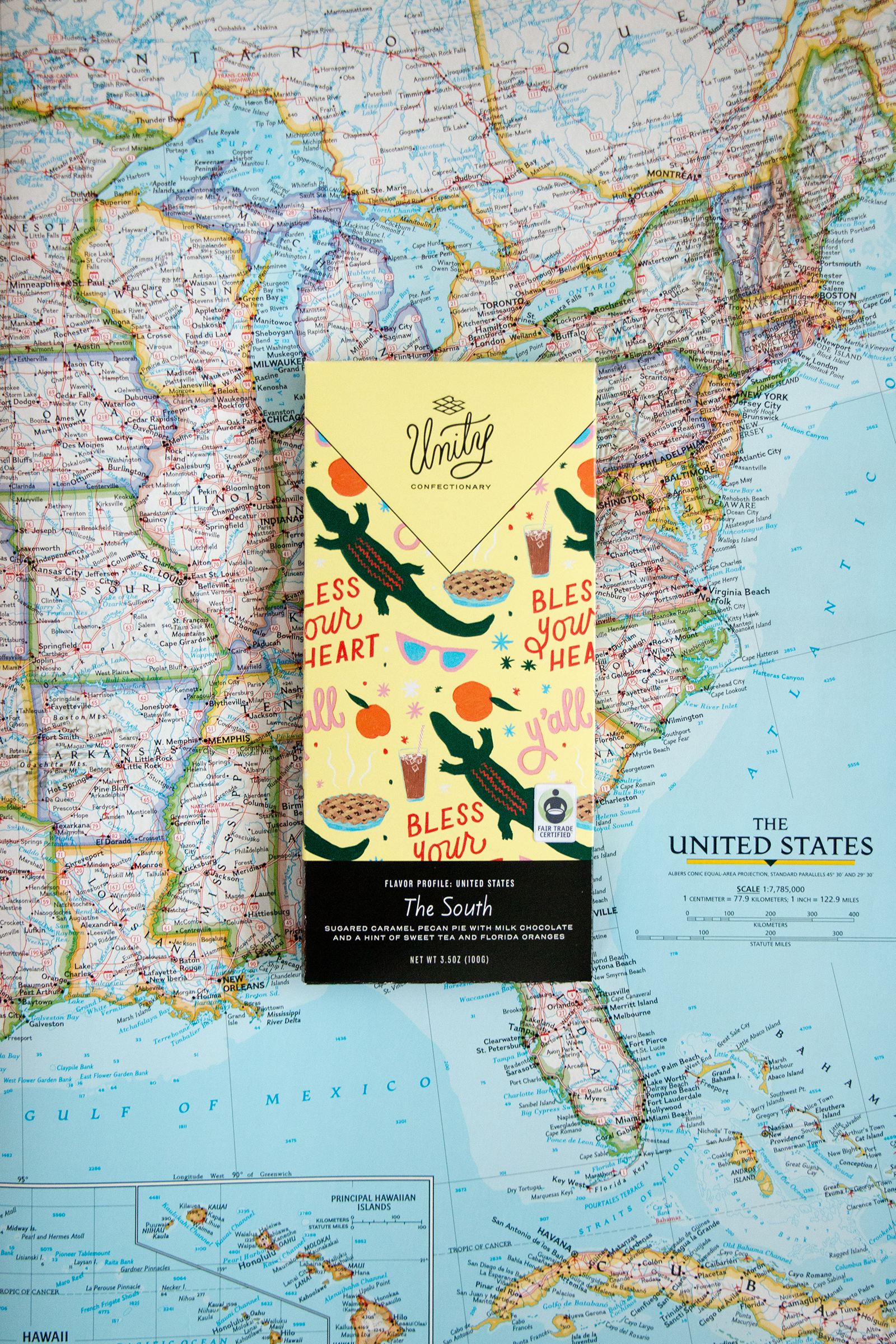
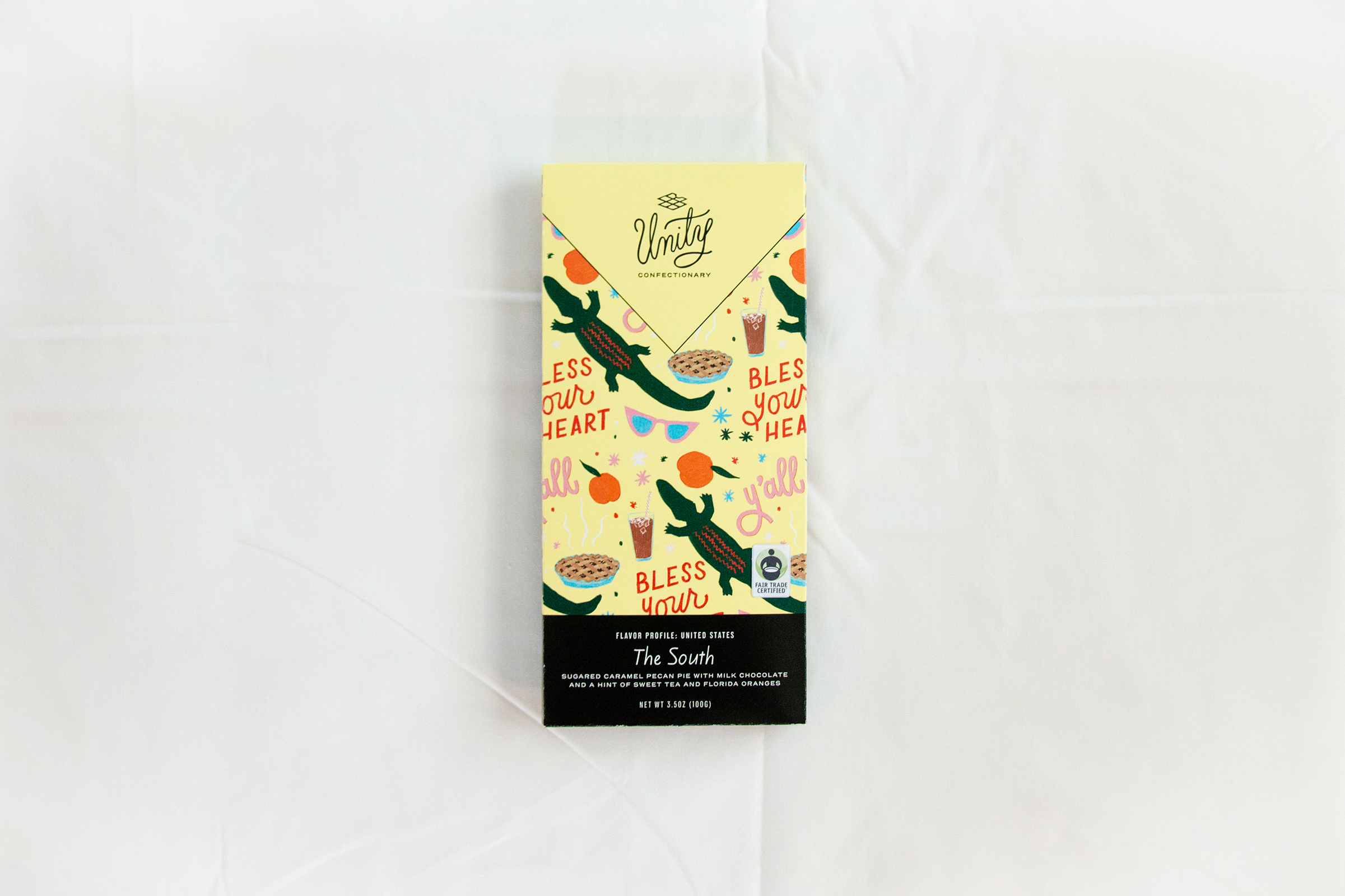
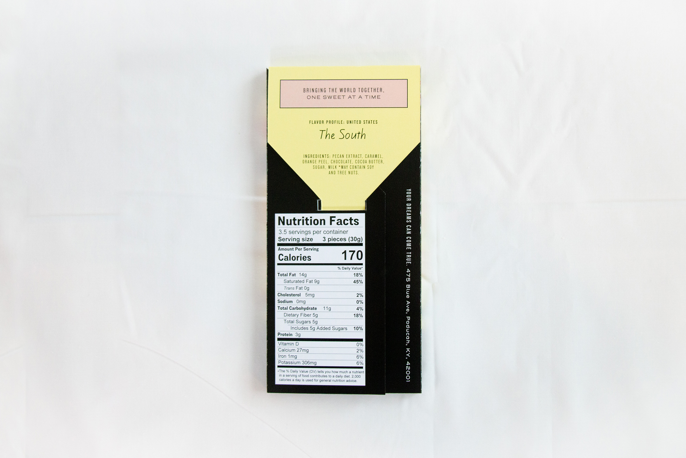
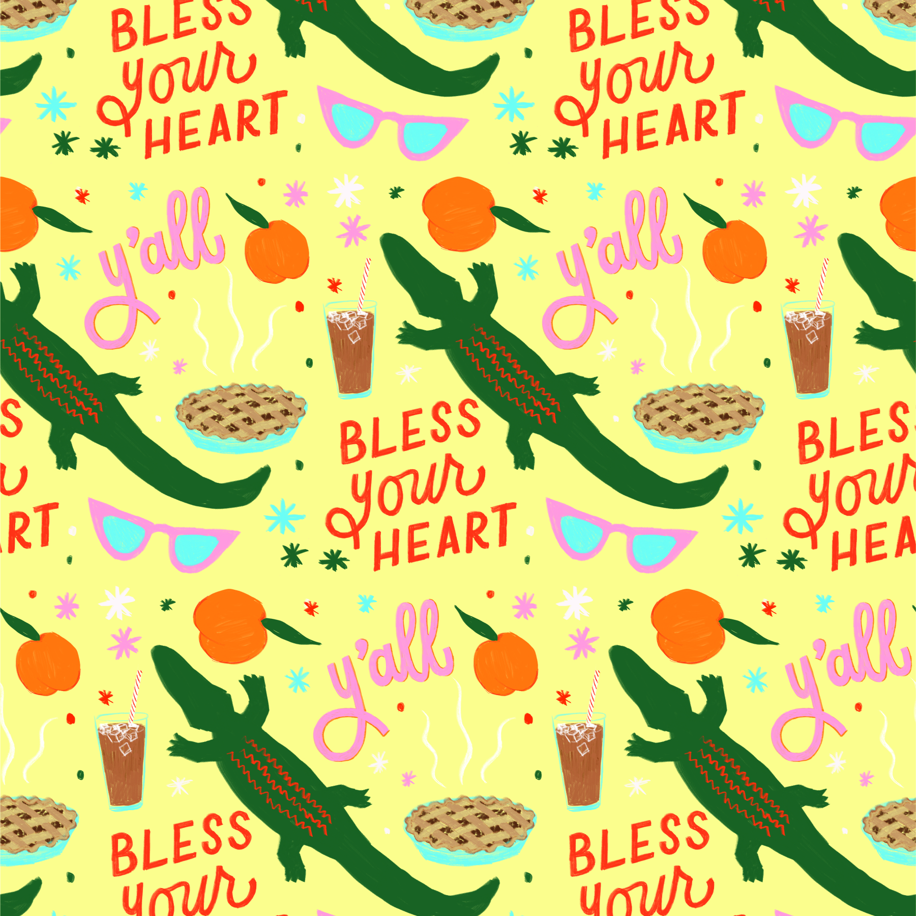
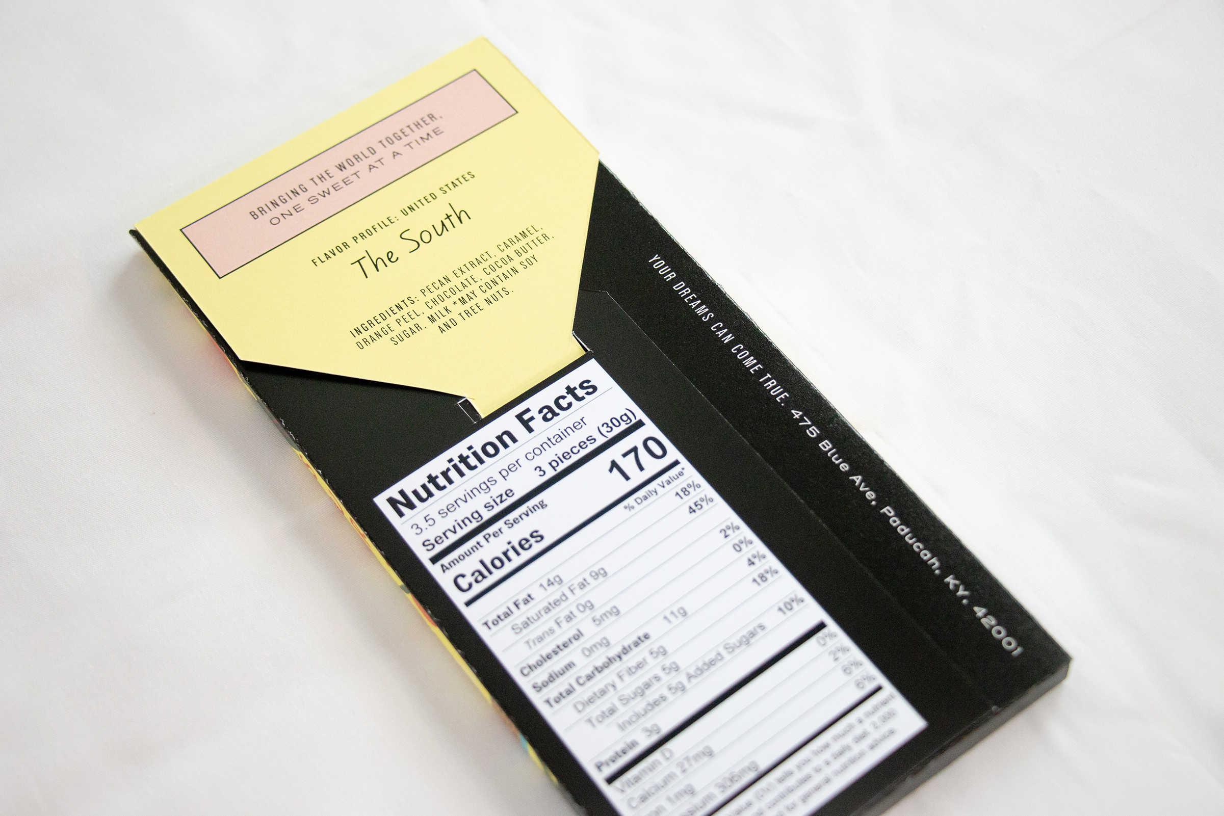
Sugared caramel pecan pie with milk chocolate and a hint of sweet tea and Florida oranges.
The South has such a unique personality that it was hard to narrow down characteristics that best describe it, but in general, southerners are known for being down-to-earth, having big front porches, always drinking sweet tea, saying terms of endearment all the time like “bless your heart”, their fresh fruit (FL/GA!), and mama’s home cooking (hello, pecan pie!). They’re also known for the Sunshine State itself and the famed Georgia peaches.
flavor profile
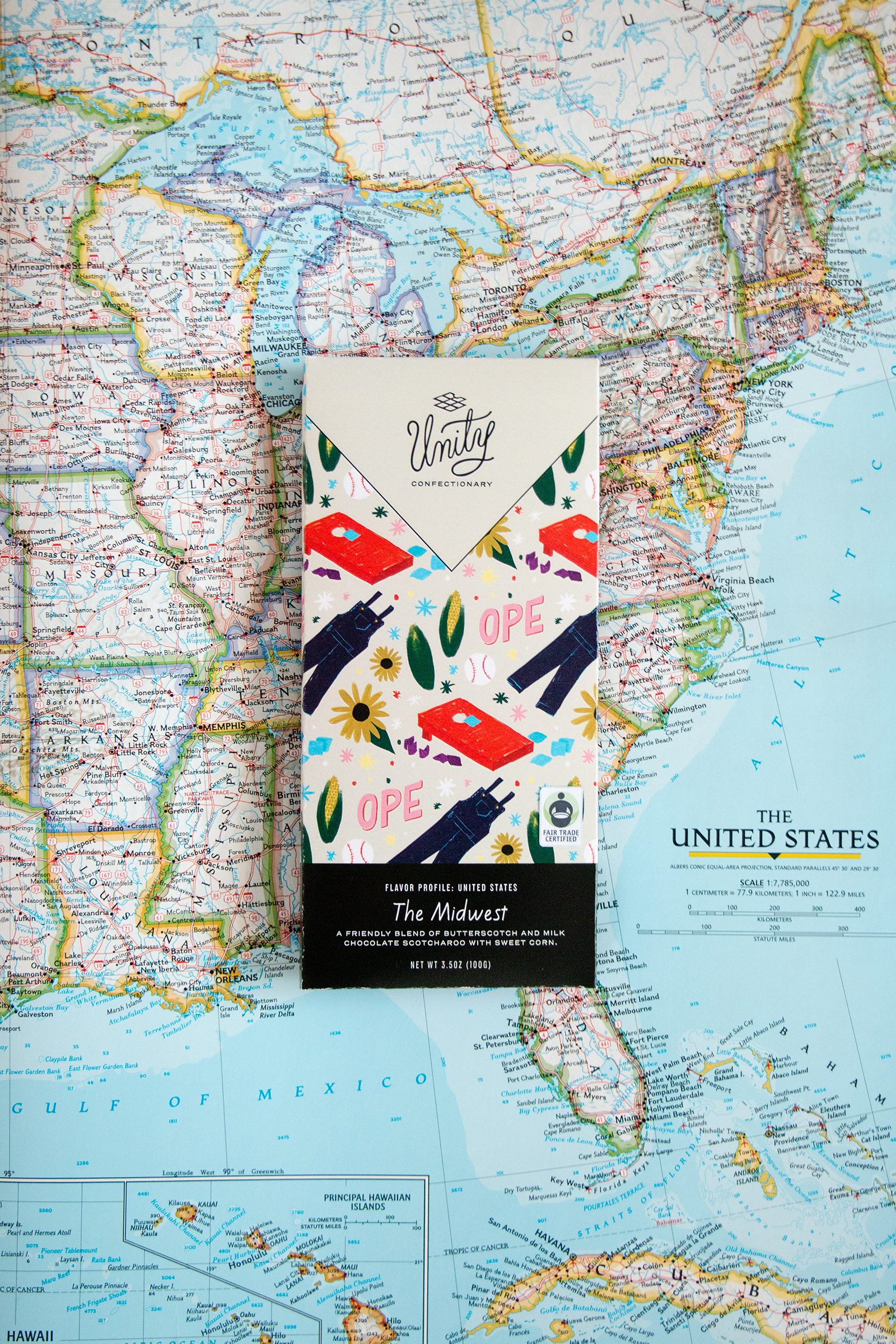
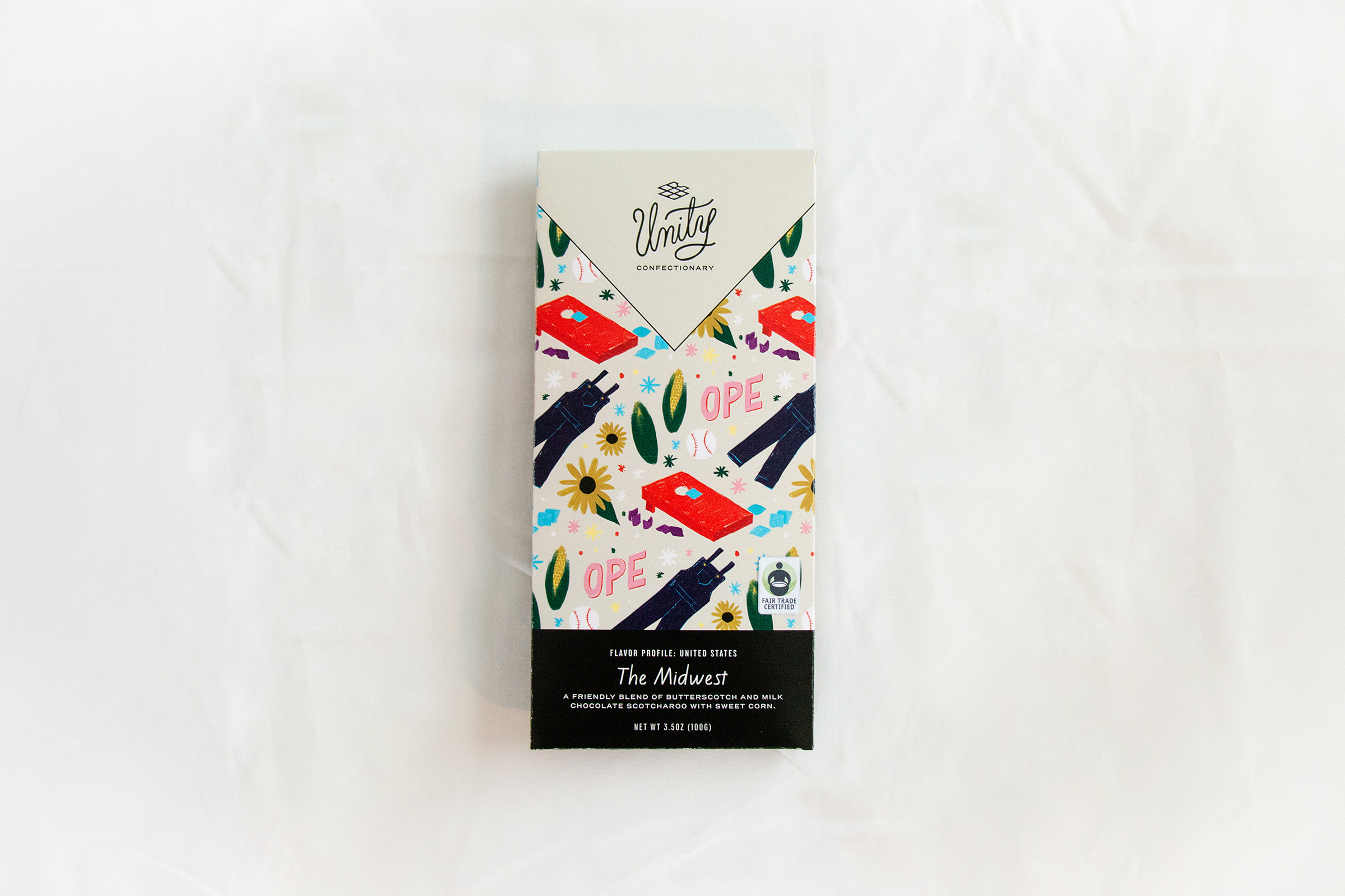
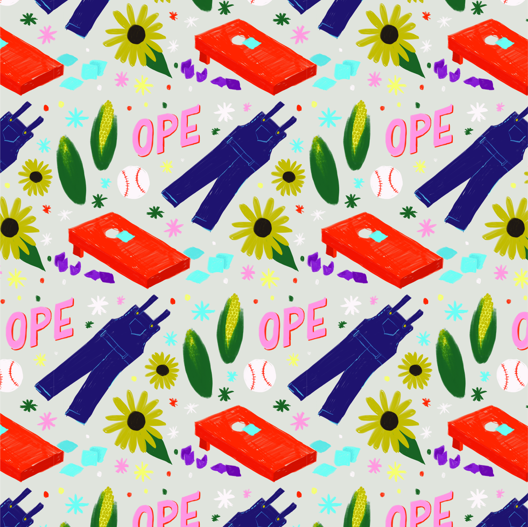
A friendly blend of butterscotch and milk chocolate scotcharoo with sweet corn.
The Midwest is stereotypically known for being flat and full of corn and boring. Because of this, I used one of the most famous midwestern wall paint colors, “greige” as the base color of this chocolate bar. But fear not! In spite of its seeming boring-ness, the midwest is also known for some of the friendliest people in the country, and for saying “ope” all the time. We’ve got corn, potlucks, and baseball. And ranch. Lots of ranch dressing.
flavor profile:
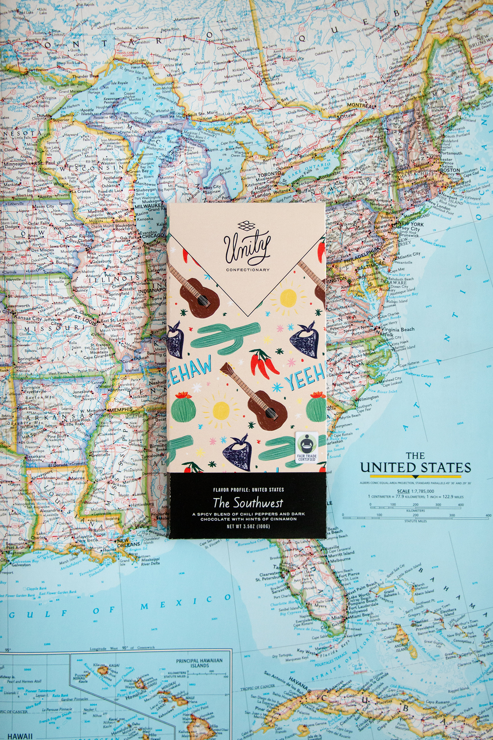
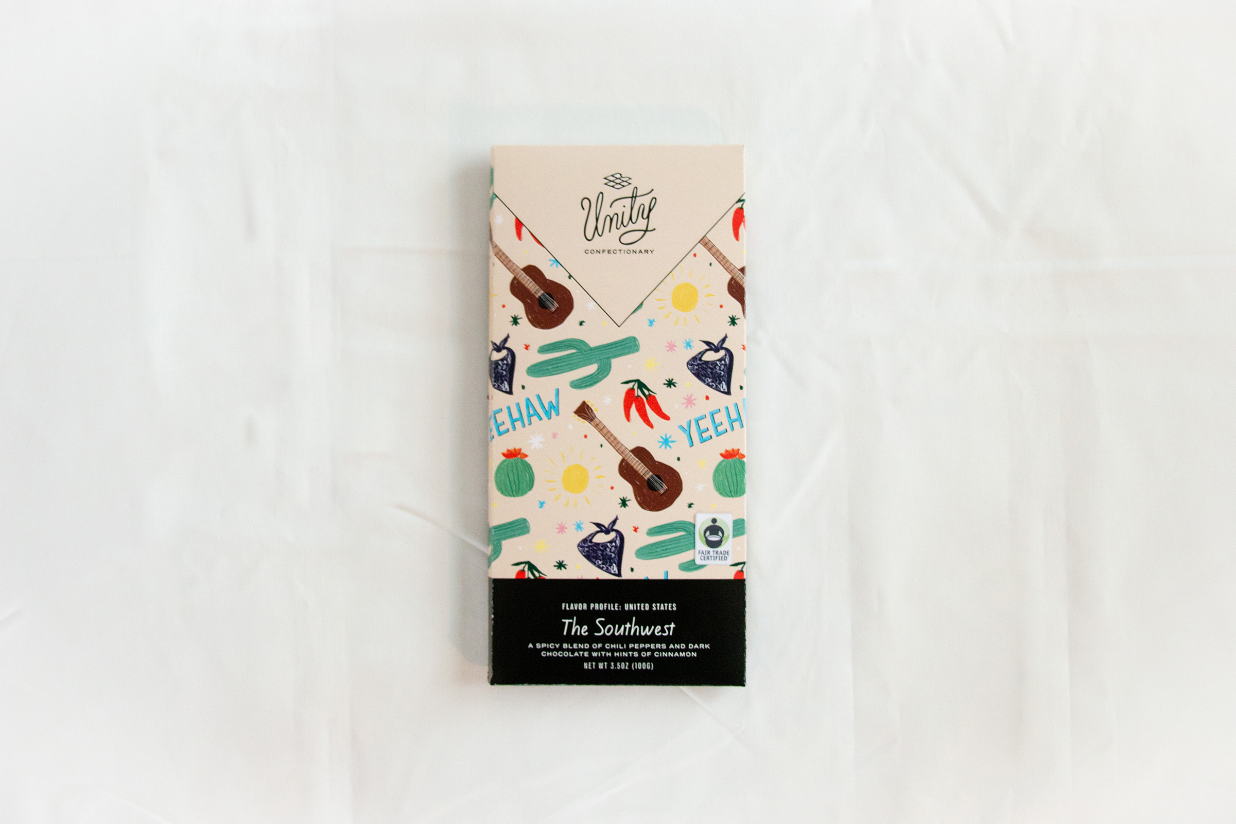
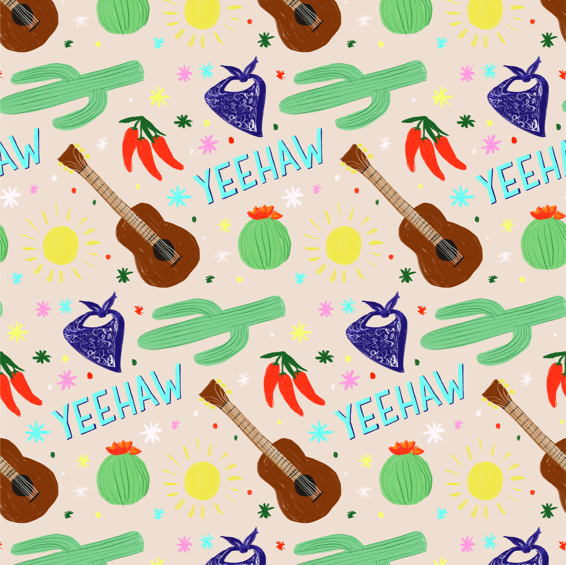
A spicy blend of chili peppers and dark chocolate with hints of cinnamon.
The Southwest brings the heat, especially with Arizona and Texas in the mix. This region needed a dusty, hot, cactus vibe. This is the desert of the United States and thus is known for its popular tourist destinations, the Grand Canyon and the Native American cliff dwellings. Rodeos, boots, and hot chili peppers are also traits of the area, as well as cowboys and ranchers.
flavor profile:
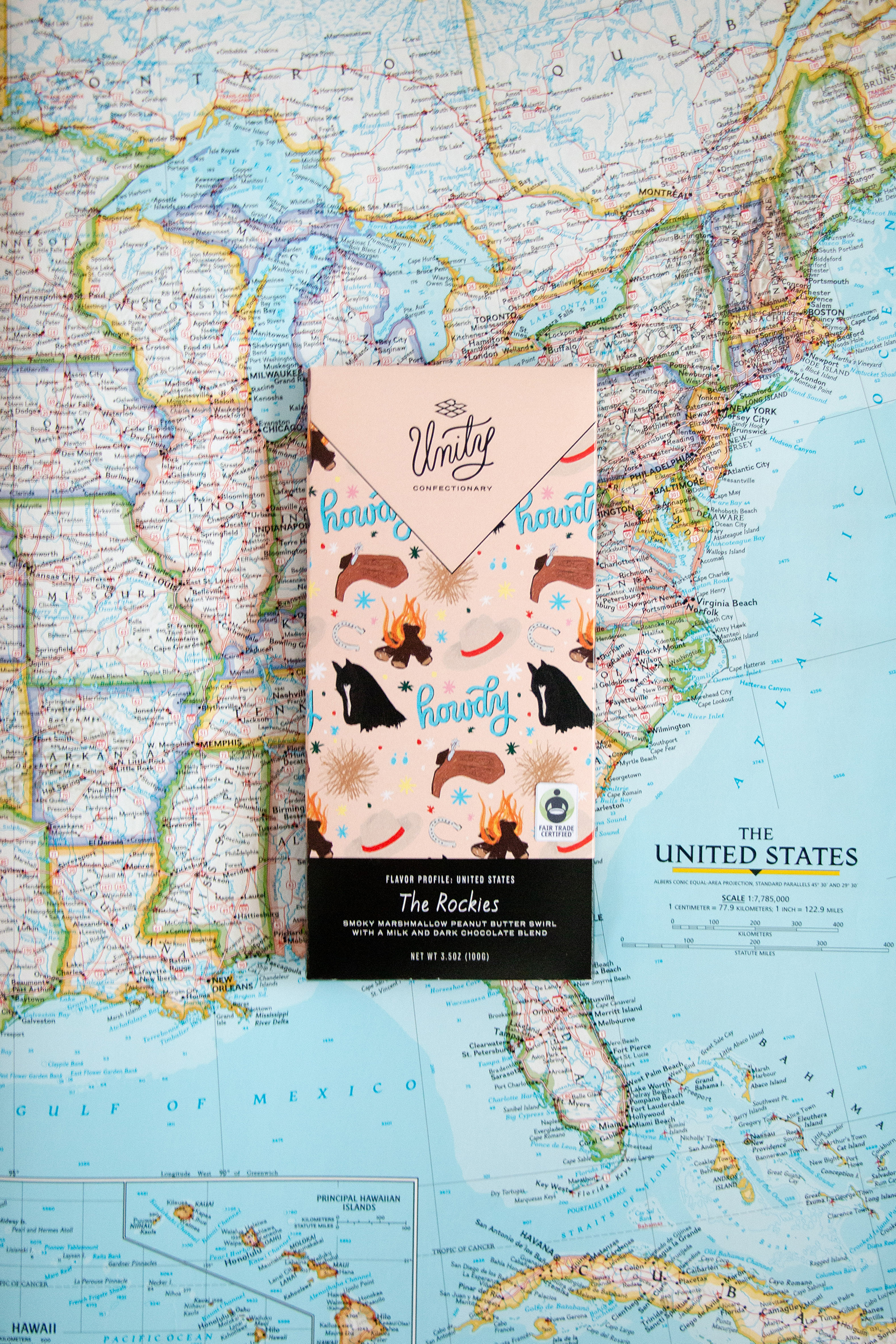
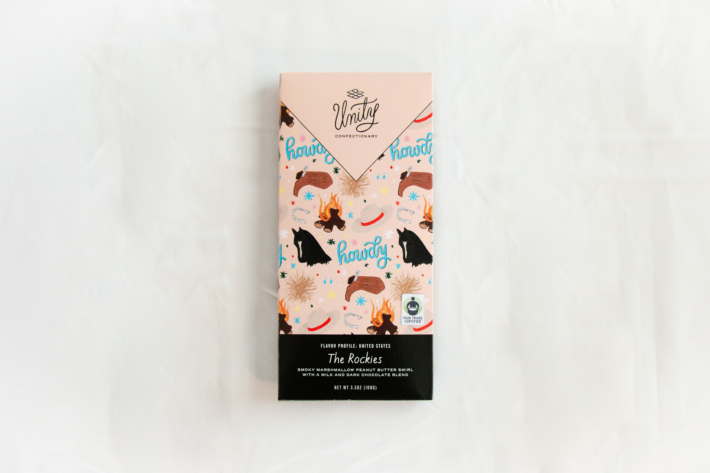
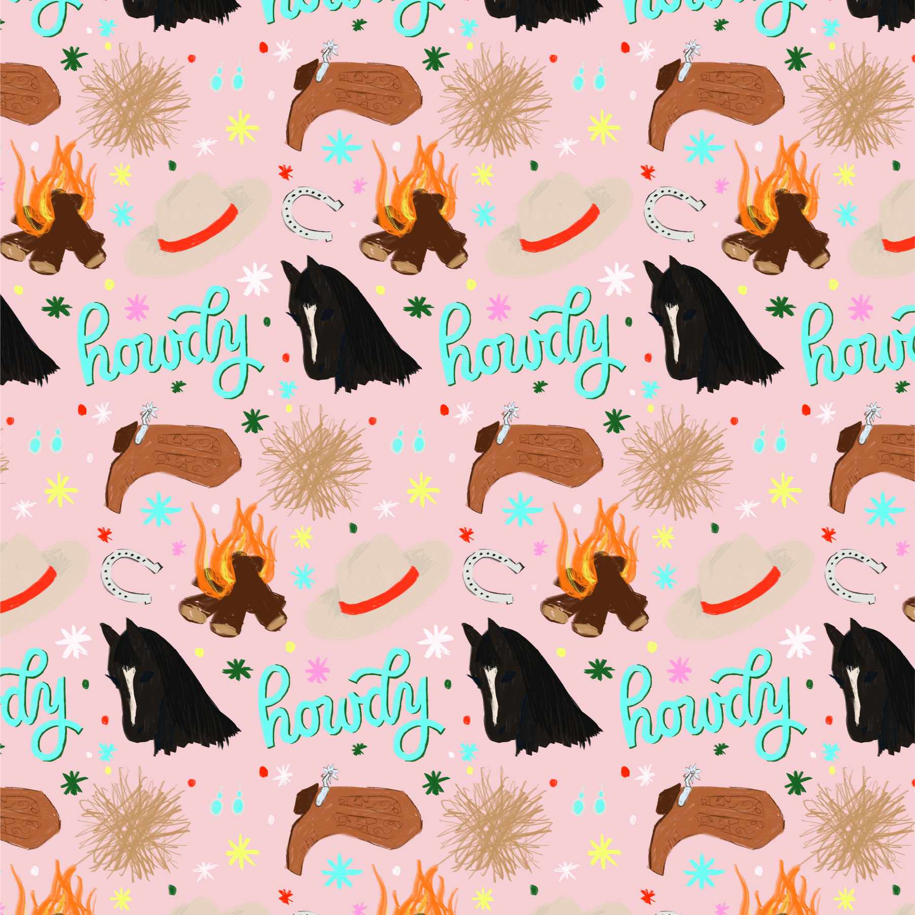
Smoky marshmallow peanut butter swirl with a milk and dark chocolate blend.
The Rockies are home to vast mountains and vast prairies. This is the “wild west” at its finest, and is home to a lot of hikers, ranchers, and people who don’t like people. This area features more cowboys and tumbleweeds and people who live off the land. Did I mention campfires? Tales around the fire are a classic.
flavor profile:
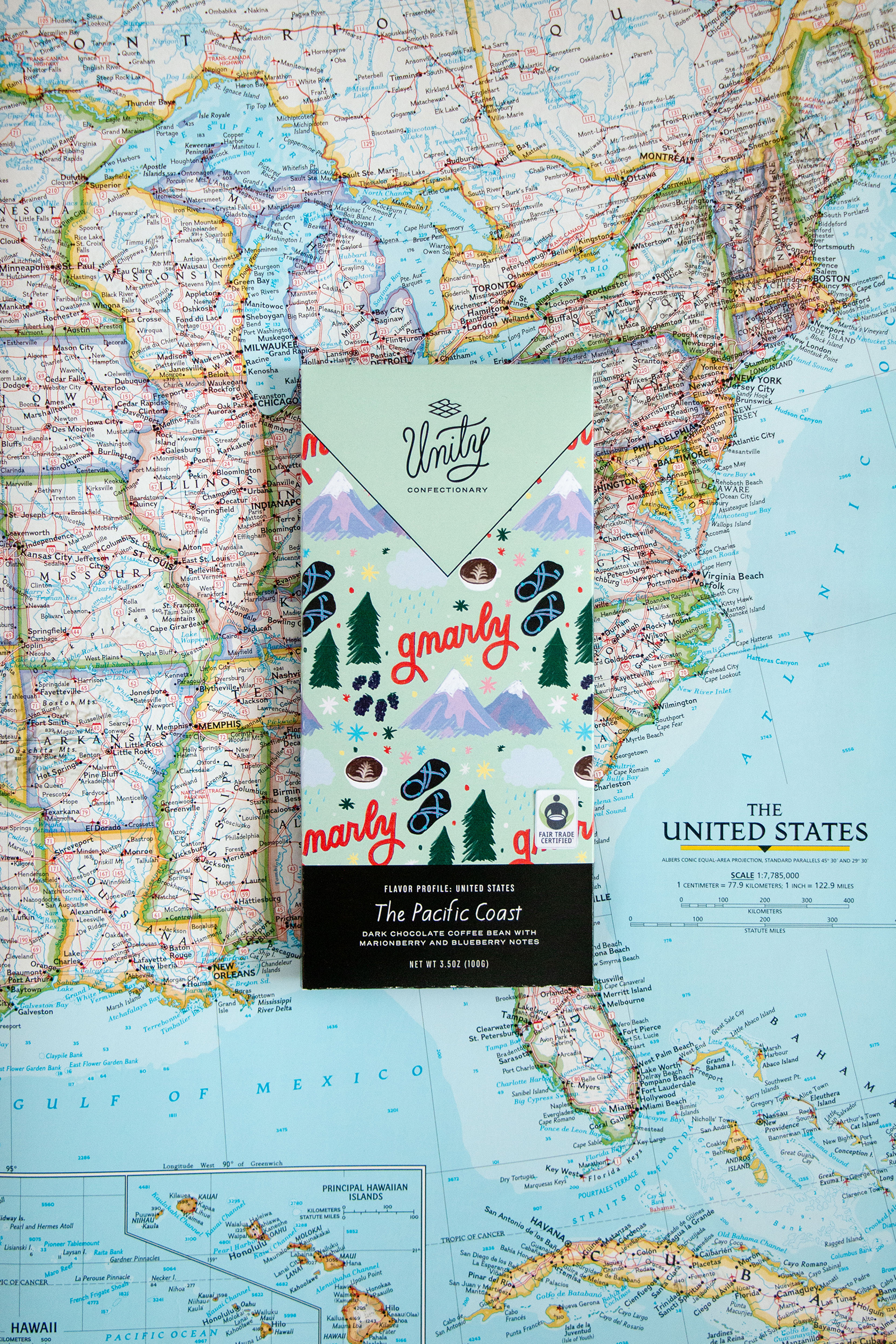
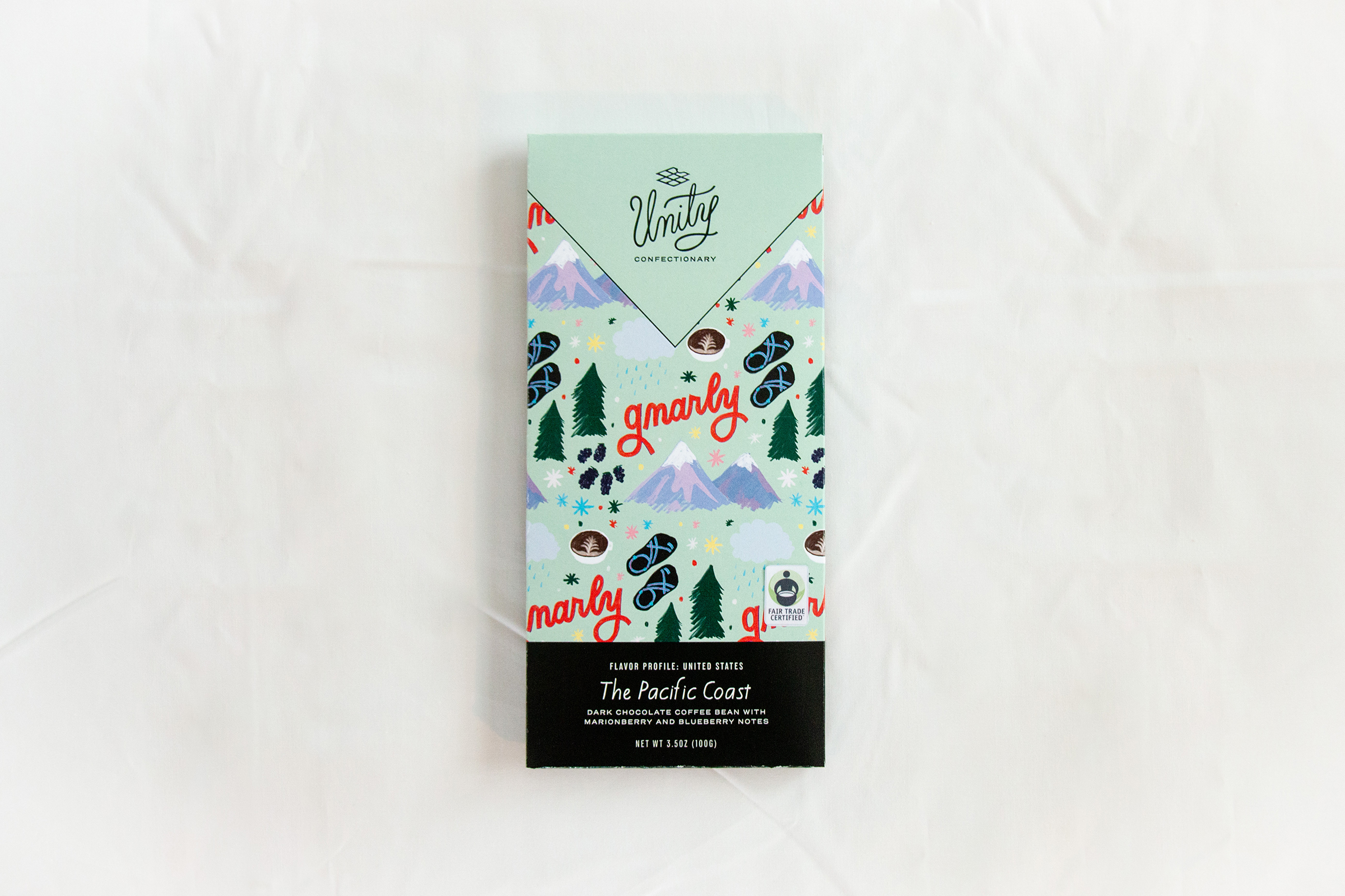
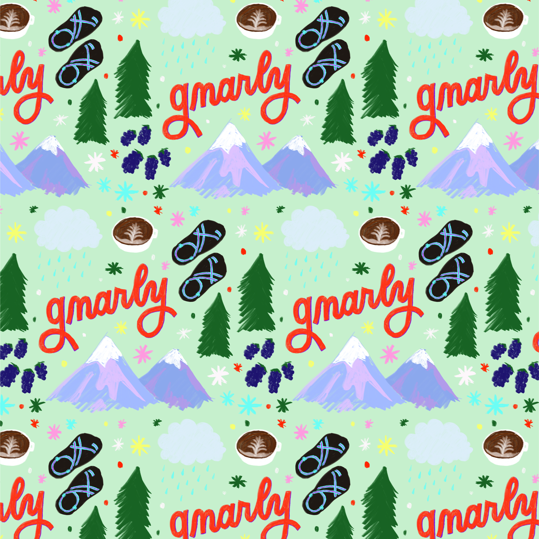
Dark chocolate coffee beans with marionberry and blueberry notes.
The Pacific is its own breed of people, known for being naturalists, outdoorsy, and saying “gnarly” all the time. There’s a lot of rain here apparently and also mountains. This is the region where you can find flower farms and berry farms and grass farms and a lot of people drinking coffee and wearing chacos.
flavor profile:
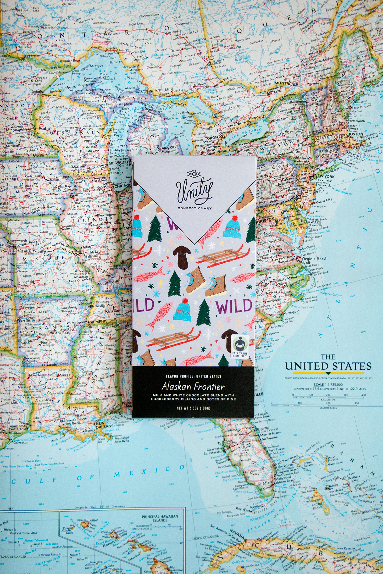
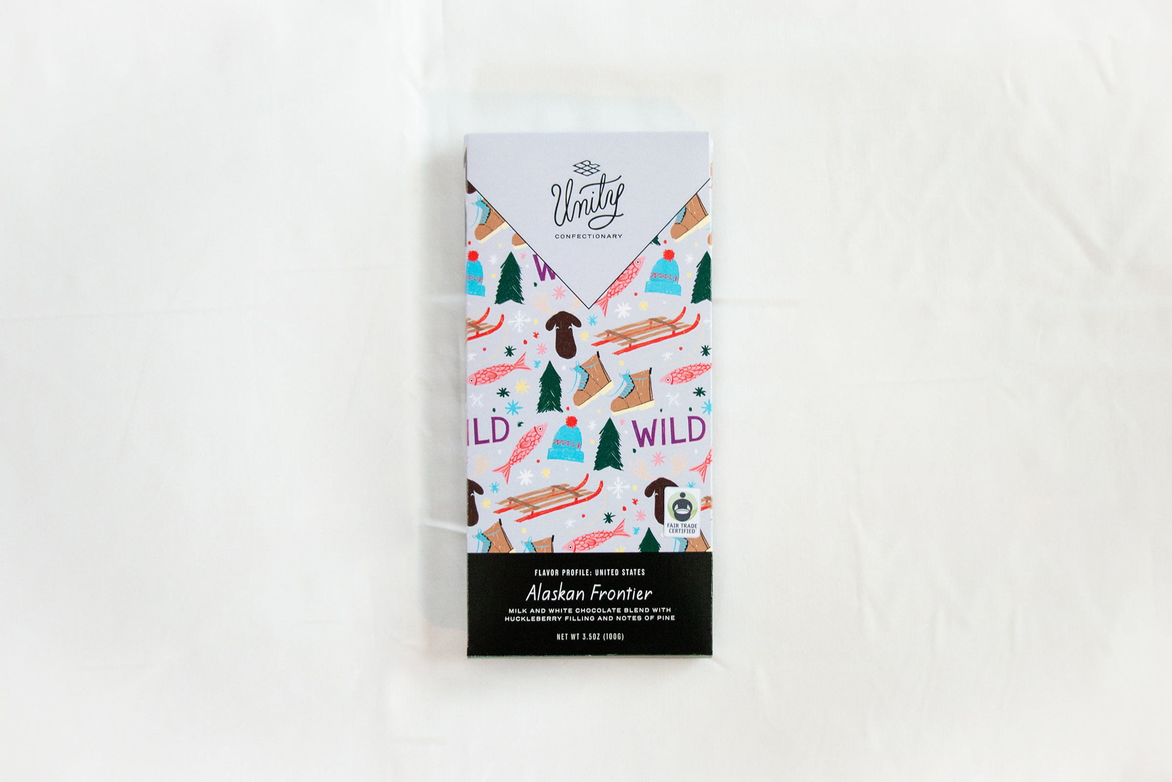
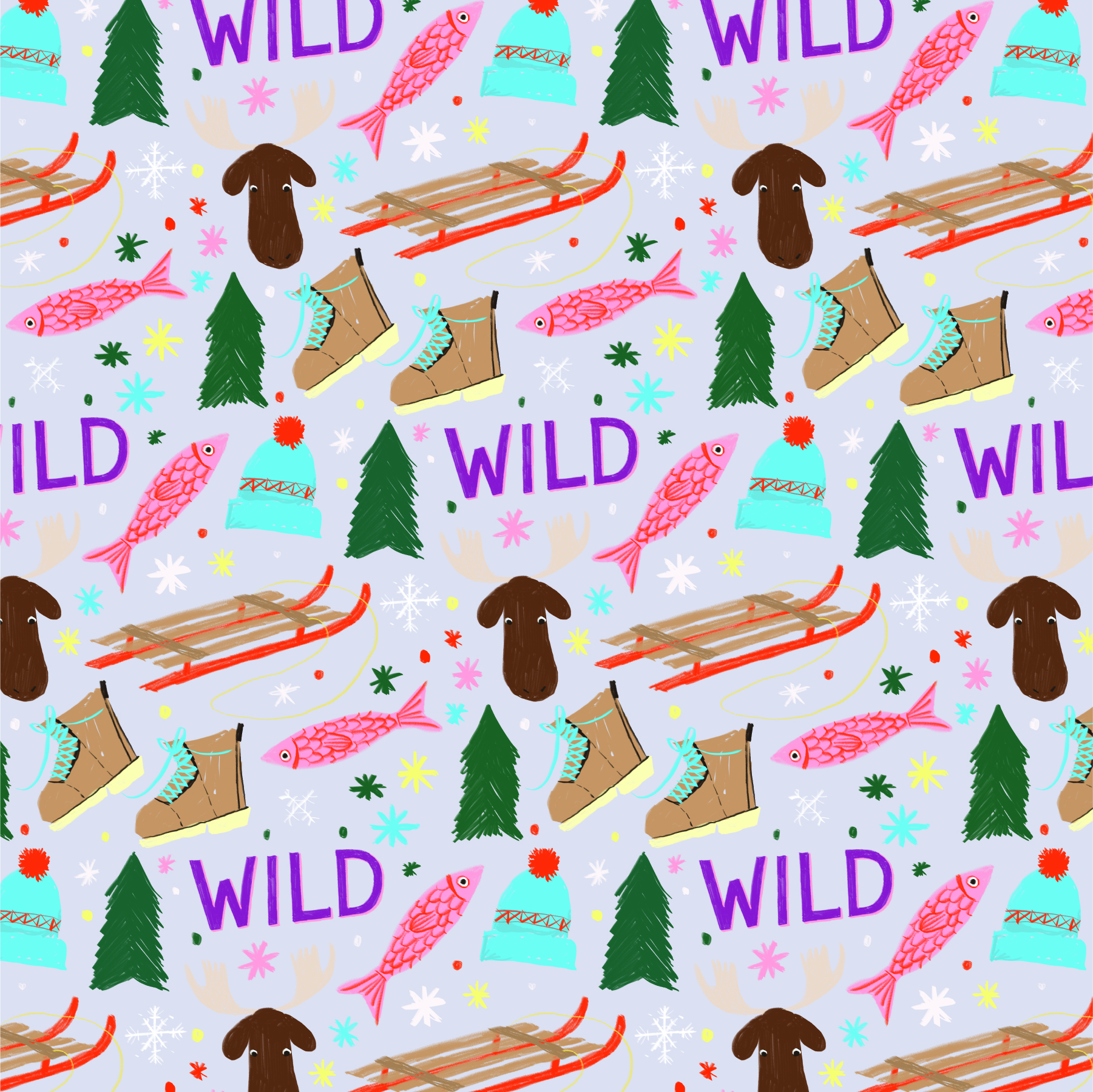
A milk and white chocolate blend with huckleberry filling and notes of pine.
Alaska is one of the biggest regions according to land mass but has some of the fewest people. Known as “The Wild Frontier” and for being freezing and having bears, this region has its own system for everything. This region is also known as being off the grid and isolated, a place where only the fittest survive. They are also known for their wildlife, and are home to many salmon and elk.
flavor profile:
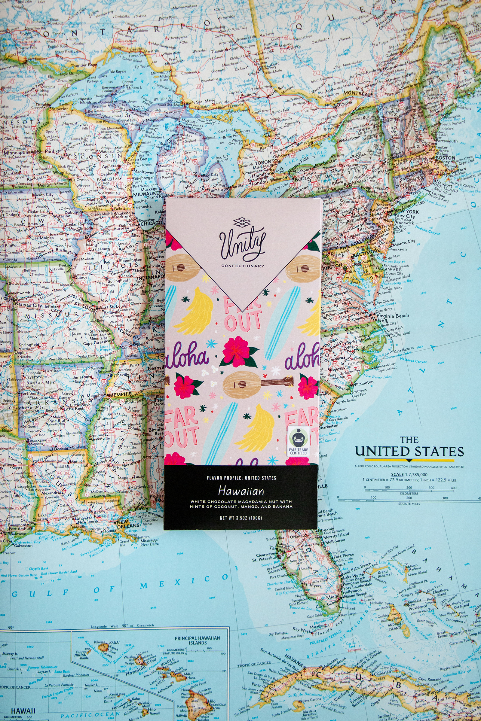
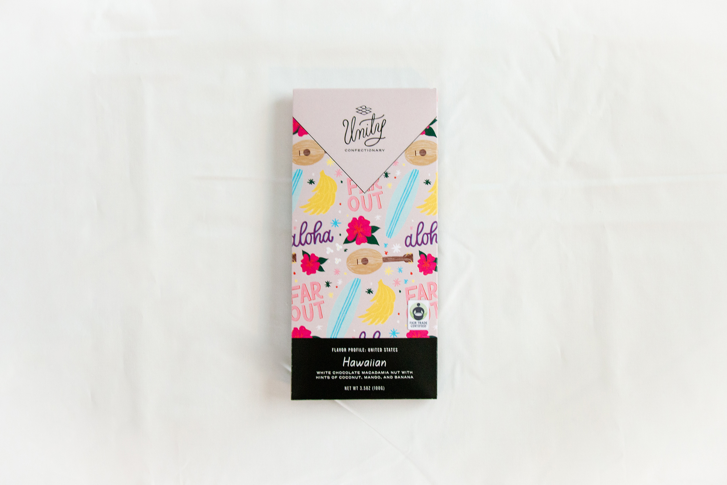
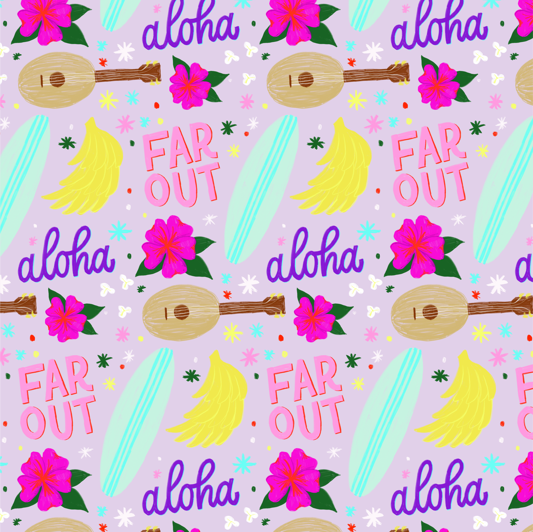
White chocolate macadamia nut with hints of coconut, mango, and banana.
Hawaii has its own cultural elements that bring a unique flavor to this island community. Here, life is chill and “far out” and something out of island-living dreams. Fresh fruit, surfing, sandy beaches and killer sunsets, ukuleles and tourists, this area is tropical to a T. Known for its cultural background of both native Hawaiian and Japanese heritage, this region is rich with tradition and culture.

App prototype for Unity Confectionary shop & information center.

You may also like:
Solstice Honey
Branding and label design for a local beekeeper.

Teavana Rebrand
Re-imagining an existing brand with a new target audience.
Cora Skincare
Branding for a conceptual skincare line based around olive oil.
